
This post was co-published with Mozilla-OpenNews's Source, who have also published an interview with Jeff Larson.
A little over a month ago, Al Shaw and I made an interactive map of the “Great Migration” of African Americans from the rural south to northern cities during the 20th century. The housing discrimination suffered by African Americans in their new cities led to calls for reforms, resulting in the Fair Housing Act of 1968. But as the fantastic reporting by ProPublica reporter Nikole Hannah-Jones shows, the federal Housing and Urban Development agency has fallen short of its requirement to take affirmative steps to curb segregation in America’s cities and provide fair housing for everybody.
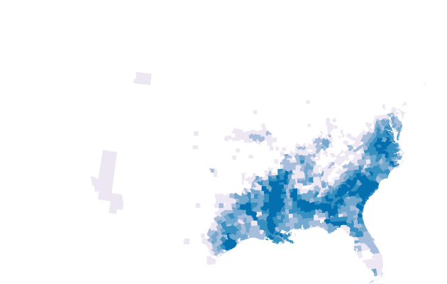
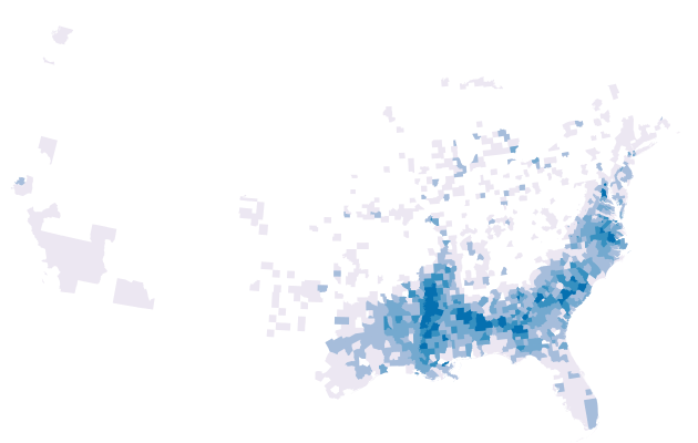
To accompany the story we wanted to make a map showing the Great Migration itself. We also decided early on that it would be the lead art for the article.
My first impulse was to create a vector-based (as in math, not as in SVG) map, like the wind map Martin Wattenberg and Fernanda Viegas made, which would show the paths that African Americans took to northern cities over the decades. But I couldn’t quite wrap my brain around how to apportion the changes between individual counties. For example, if a particular county loses ten black people in a decade, where did they actually move to? The answer was unclear — it could be that five of them moved north and five of them died. When you are dealing with decennial censuses the exact ratio is impossible to know.
Another problem, and the most important one to solve, was finding the data, but I had the answer. In 2011, as part of research for our Redistricting story, I had stumbled across NHGIS, a program run out of the University of Minnesota that has painstakingly collected census and geographic data from the 1790 to the 2010 censuses and provides it to researchers and journalists free of charge. It is a truly amazing resource.
Incidentally, I think my favorite census was the 1890 census, which was the first to use punch cards for tabulation, in addition to handwritten forms. It took only one year to calculate the total population of the United States in 1890 versus eight years for the 1880 census, and is a watershed moment in the history of computing. A fire destroyed most of the 1890 census materials, which led to the creation of the National Archives.
So, ok, now I had the data, and I knew which kind of map I couldn’t make, how did I settle on an animated chloropleth map? I had two inspirations:
The first inspiration came from a graphic by Joe Ward, Xaquín G.V., Alan McLean and Graham Roberts published in the New York Times called “How to Win: The Hurdles.” The Times used motion capture to film Olympic hurdler Lolo Jones, and allowed users to click and drag back and forth to see exactly how Jones clears hurdles during races. Most importantly, users could go frame by frame to find the most interesting parts.
The Times graphic had me thinking back to my first job out of college.
The first professional(ish) job I ever had was as a video editor for a small San Francisco production company. One of the best parts of video editing is how good the tools are. In the hands of a capable editor, the editing bay is an extension of the body. Slicing and dicing video is effortless and fast thanks to the engineers and user interface experts who have optimized the typical video editing workflow. If you’re interested in video editing, either as a hobby or professionally, run to the bookstore, right now, I’ll wait — the internet is forever — and pick up a copy of “In the Blink of an Eye” by Walter Murch.
When it comes to actually editing, the most important innovation in video technology, hands down, is “scrubbing.” Video scrubbing is a neat trick where an editor can preview an edit by dragging their mouse back and forth over a video clip or edit point to preview the faster than normal video. If you use iPhoto, you’ve probably seen this effect when you view your photos in the date view and move your mouse back and forth. This fine-grained control, like in the Times’s graphic, allows an editor to find awkward moments or mistakes quickly.
The key realization I had was that this scrubbing motion feels really natural when using a mouse or swiping with your finger on a mobile device like a tablet. Because my time series of census choropleths was, like a video, really just a bunch of images, I could make a little video in the browser that was easy to “scrub,” in much the same way a video editor does.
When you’re making things on deadline, having data and inspiration is the best possible situation. To make the actual maps, I grabbed data from my favorite GIS warehouse, Natural Earth, to flesh out the county data from NHGIS. I then used Simple Tiles to generate a series of images from 1890 to 2010 representing African-American population. The code was really simple.
The only other implementation trick was to define the breaks between frames in the map, but that also turned out to be really easy. I added a mouseover handler on the map’s element and used this code to figure out which image to show:
var bucket = (e.offsetX || e.pageX) / (width / years.length) | 0;
Basically that picks a year based on which portion of the map the cursor is in. The fun bit is the | 0 part, which confuses some people, but, in JavaScript, OR-ing a floating point value by zero does the equivalent of Math.floor.
I’m not the greatest designer so Al Shaw created the UI and Lena Groeger helped a bit with the labels on the map.
The Great Migration is a fascinating and historically rich subject, and often it is important in news to look back in time to see how we got where we are. I hope the graphic helps a bit in that goal.


