This is the second of two posts about the 21st Malofiej World Infographic Summit. Read the first here.
In one of the final sessions of the 21st Malofiej World Infographic Summit on Friday in Pamplona, Spain, Nigel Holmes noted the common theme of “hands” in the week’s presentations.
“We are humans, we are not attached to machines,” Holmes said as he presented a tongue-in-cheek look at “non-informational art” — fine art made by graphic journalists and artists when they weren’t making infographics.
As the conference was coming to a close, Holmes’ drawing attention to hands struck me as particularly insightful. One of the main undercurrents during the week was the tension between illustrative graphics, often borne out of photographs and sketches, and data visualization, whose raw material is often the very machine-based spreadsheet.
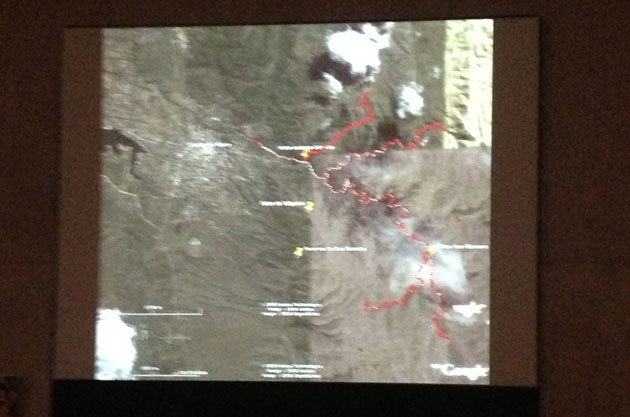
The presentations on Day 2 almost seemed to alternate between these two styles of information graphics in turn. The day started off with Juan Colombato from La Voz del Interior in Córdoba, Argentina, who explained his methods of creating graphics, starting with sketching, photographs, tracing Google Earth, research and reporting with experts.
The themes in Colombato’s presentation were echoed in those from Amanda Hobbs (the former Art Research Editor at National Geographic magazine) and Jen Christiansen of Scientific American.
In contrast were the presentations of Jan Willem Tulp, and Frédérik Ruys, who spoke of the process behind creating data-based interactive and motion graphics.
What struck me about all the Day 2 speakers was the emphasis on the data collection and analysis process, something you don’t expect to hear much about at a conference dedicated to presentation. The Malofiej awards are judged on effectively conveying information graphically, not necessarily on how the information was gathered or analyzed. Nevertheless, process was a big part of the lectures, and it was fascinating to hear the different approaches taken by different publications. Both the illustration-graphics and data-visualization camps shared similar methods.
Hobbs couldn’t stress enough that the illustrations in National Geographic were not artistic renderings, but rather reported works based on extensive consultation with experts. Hundreds of emails and sketches (some on Post-Its) of proposed graphical bits were exchanged in pursuit of accuracy. Likewise, Colombato said that in order to cut through the jargon one usually hears from experts, he would often ask how they would draw something if they had to.

Ruys, a journalist and designer focused on motion graphics, and Tulp, a freelance interactive developer and designer, talked about using data as a primary source, and the struggles to clean the data as well as to find stories in it. When describing one of his sources, a database of shipping routes, Ruys showed an example of dirty data in the “destination” column. Certain captains would leave destinations blank, and others would even try to be funny, entering values like “pirate bay,” or “wherever there is water.” He ended up throwing out that data point because it was too messy. When looking at the shipping data for an animated sequence in a documentary called “Netherlands from Above,” he also spoke of finding stories in spreadsheets. In the end, he decided to focus on the journey of one ship rather than showing the whole set.
Tulp analyzed Dutch elections data for a project called Close Votes because he was curious whether certain cities in the Netherlands voted alike. Through his analysis and resulting data visualization, he discovered that the Dutch “bible belt” all voted similarly, and even discovered what may be the most religious city in the Netherlands based on its extreme voting patterns. While he could have done more to highlight the interesting findings (the graphic was, as we say, all near, no far), it was a good example of data visualization as generative storytelling — graphics that actually generate stories themselves.
The tension between illustration graphics and data visualizations also dovetails with another axis at Malofiej: representative and figurative work versus abstract and geometric presentation of findings.
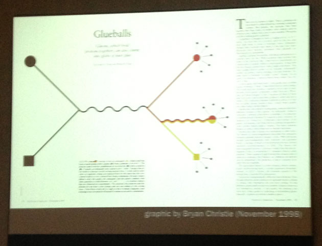
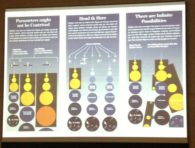
The best example of this split was a story Jen Christiansen told of a graphic she was developing on the expansion of the universe for Scientific American. Having been inspired by a 1998 minimalist scientific graphic by Bryan Christie, she set out to explain the phenomenon with a very elegant graphic of continually expanding circles (the observable universe) within a cone. After speaking with editors, she gradually came around to the idea of adding more representational detail, such as making the circles spherical and adding small illustrations of space phenomena. While the colors in the initial version were bright and primary, the final graphic took on the traditional look of space graphics — black background with spheres. After seeing the final product, I finally understood what the graphic was explaining. Christiansen called these trappings a “welcoming gesture,” and a “glass of wine before a challenging plate of tripe.” Easing readers into data through representation is something those on the pure data-visualization side can learn a lot from.

These axes were a useful lens through which to understand where the Malofiej contest judges gave awards. The New York Times — especially Archie Tse’s work, which won a Gold medal for Individual Portfolio — shows a mastery of both axes: illustration-based, representational explanations of how various Olympians win at their sports, alongside abstract (to the point of austere) shoreline-free flood maps for Hurricane Sandy coverage. His work is based on sketches and reporting, and it’s based on massive data sets. The Malofiej judges looked for mastery along both axes.
Correction, March 18, 2013: Jen Christiansen works for Scientific American, not American Scientist. The spheres in her graphic represent the expansion of the observable universe, not discrete planets.
Correction, March 19, 2013: Amanda Hobbs was formerly the Art Research Editor, not an Art Director, at National Geographic magazine. The role of Post-Its in her work has been clarified.


