
Introduction
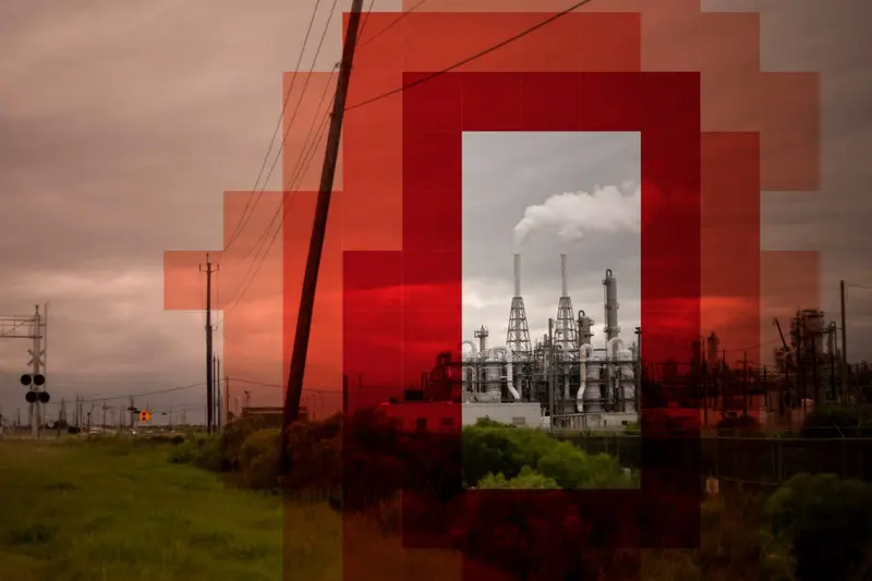
ProPublica spent two years analyzing billions of rows of EPA data to visualize the spread of toxic air pollution from industrial facilities in the U.S. The result is the most detailed map of cancer-causing industrial air pollution ever published.
The analysis underlying our map uses data from an EPA model called Risk-Screening Environmental Indicators, or RSEI. This model takes a variety of inputs, including emissions data, weather modeling, and facility specific information, and puts out estimated concentrations of toxic chemicals in the air around industrial facilities. In this methodology, we explain how we used the EPA’s database to compute cancer risk estimates for air releases and discuss the advantages and shortcomings of using EPA data to map industrial cancer risk.
Cancer is the second-leading cause of death in the U.S., after heart disease. A variety of factors may contribute to an individual’s risk of developing cancer, including age, family history, access to health care, diet and exercise. Our map should not be used to try to establish with any certainty that an individual case of cancer was the result of toxic releases from specific industrial facilities. Rather, it provides a starting point for readers to learn more about the potential sources of industrial cancer risk near them.
What Our Map Does (and Does Not) Include
Cancer-Causing Air Toxics
Air toxics, also known as hazardous air pollutants, are a class of 187 chemicals that are known or suspected to cause cancer and other serious health effects, according to the EPA. The purpose of ProPublica’s map is to visualize the cumulative cancer risk from toxic industrial air pollution. When the EPA undertakes a risk assessment, it does so by considering certain types of facilities and equipment in isolation, which underestimates the true amount of pollution in the air for people who live near multiple industrial facilities. While the EPA might deem the risk of an individual facility “acceptable” or “safe” by itself, our analysis shows that the harm can be more substantial when risks from facilities are considered in aggregate.
Our multiyear analysis computes estimates of cancer risk generated by many of the large industrial facilities in an area. Unlike the risks from other conditions linked to toxic air pollution, such as asthma and diabetes, cancer risk from EPA-regulated hazardous air pollutants is additive. Therefore, our analysis only includes pollutants for which the EPA has sufficient evidence to produce a cancer risk value. For example, lead, a dangerous neurotoxin that has been linked to developmental deficiencies in children, is not included in our map.
Not all known carcinogens are classified as hazardous air pollutants. Just because the EPA does not consider an air toxic to be a known human carcinogen does not mean that it cannot cause cancer — it simply means that the EPA’s body of science has not yet identified an association. It is important to note that air toxics are linked to other health effects as well, such as headaches, asthma, seizures and poor birth outcomes.
Our analysis excludes the six “criteria pollutants” that are common in our environment: carbon monoxide, lead, ground-level ozone, particulate matter, nitrogen dioxide and sulfur dioxide. While some of these chemicals have been linked to adverse health effects, they are regulated differently than other air toxics, and are not reported to the EPA’s Toxics Release Inventory. While the EPA classifies particulate matter in diesel exhaust as a likely human carcinogen, the agency has not yet assigned it a cancer potency value, and RSEI does not model it.
Selection of Facilities in Our Analysis
The EPA’s RSEI model that powers our map uses emissions data from facilities that report to the agency’s Toxics Release Inventory database, or TRI. Not all industrial facilities are required to report to TRI. Only facilities that fall under certain industry codes, have ten or more full-time employees, and manufacture, process or use certain amounts of specific chemicals are required to submit their data annually to TRI. For this reason, toxic hot spots may be present in many places that are not indicated on our map, which only visualizes pollution from certain kinds of large industrial sources.
Other Sources of Cancer-Causing Air Pollution
Our map and analysis focus on cancer-causing pollution generated from stationary sources. This type of air pollution acutely affects Americans who live on or near the fence lines of industrial facilities. To be sure, industrial facilities are not the only sources of cancer-causing air pollution in our society. Mobile sources — such as cars, diesel trucks and buses and ships at ports — represent significant sources of air pollution, but they are not included in TRI or in our analysis. Wildfires, toxic waste at Superfund sites or the like and use of pesticides and herbicides, to name just a few other examples, may also increase a community’s risk of cancer. Given the myriad sources of cancer-causing air pollution, our analysis is likely an underestimate.
Using Air Modeling to Understand Cancer Risk
ProPublica’s map does not show an individual’s actual exposure to toxic compounds; rather, it uses data from a sophisticated computer model that predicts where air toxics are concentrated around facilities based on emissions data that those facilities report. While air models provide conservative estimates of real-world conditions, they are often the best starting point for understanding how much any one facility or chemical might be contributing to a community’s cancer risk in an industrialized area. State environmental agencies and the EPA frequently use air modeling to screen for potential risk and make critical decisions regarding a community’s health.
Estimating Cumulative Cancer Risk with the EPA’s RSEI Model
The power of RSEI lies in its granularity: The model divides the entire country into squares of land, or “grid cells,” that are less than a mile wide — 810 meters wide, to be exact. For each grid cell, the model estimates concentrations of toxic chemicals in micrograms per cubic meter of air. For example, RSEI can provide a modeled concentration of how much ethylene oxide a particular 810-meter by 810-meter chunk of Houston contains as the result of a particular facility's reported emissions.
We analyzed nearly 7 billion rows of RSEI data to estimate industrial cancer risks for the entire country. To turn the concentration estimates that RSEI outputs into cancer risks, we first removed all of the chemicals in the database for which there was insufficient evidence to develop a cancer potency value. We were left with 105 pollutants. We then took these remaining chemicals and weighted them by a measure called the inhalation unit risk, or IUR. We used the exact IURs selected by the RSEI program, which are sourced from the California Environmental Protection Agency, the EPA’s Integrated Risk Information System and the EPA's Office of Pesticide Programs.
A chemical’s IUR is an EPA estimate of the upper-bound excess cancer risk that would result from a lifetime of continuous exposure to a chemical at a concentration of 1 mg/m³ in air. We then converted the IUR values in the RSEI chemical table (which are in 1/mg/m³) to match RSEI's chemical concentration data (which is in 1/mcg/m³). The inhalation unit risk is calculated for a specific location, even though some people may have higher or lower potential exposures based on where they live or spend most of their time.
We then summed up the total weighted concentrations to arrive at an estimated incremental lifetime cancer risk (ILCR) from all the chemicals in that grid square. This formula comes from a 2007 research paper by David Wright, former section chief of the Air Toxics and Emissions Inventory Program at the Maine Department of Environmental Protection, and is a common equation for calculating cancer risk from toxic chemical concentrations. We checked our methodology for calculating cancer risk from chemical concentrations with Wright, along with multiple other air modeling experts, including a former EPA contractor who used to work on the RSEI model.
ILCR = Σ chemical concentration × chemical IUR
After computing the cancer risk estimates in each grid cell for each year from 2014-2018, we averaged them over the five-year period.
The result is a map that shows the estimated excess cancer risk from toxic air pollution in a given slice of land if that five-year window were to be constant over a presumed 70-year lifetime.
It is important to note that our map does not definitively show how much of a chemical the public is actually exposed to due to many factors, described below.
Our calculations of the additional risks posed by industrial air toxics focus on outdoor inhalation and do not account for other pathways of exposure, such as ingestion or skin contact. Factors like age, smoking history, exposure to radiation and genetic makeup may play a critical role in altering the effects of environmental exposure to air toxics.
Any exposure risk on our map must be corroborated by additional research such as site-specific risk assessments, cancer cluster studies and air monitoring.
Identifying Toxic “Hot Spots”
The EPA’s RSEI tool models toxic chemical concentrations in the air up to 50 kilometers away from industrial facilities. At that distance, the cancer risk from a given pollution source is typically low or close to zero, but for facilities with highly toxic emissions, substantial cancer risk can persist up to and beyond the modeling limit. Our map only shades in grid cells when the estimated cancer risk over a lifetime averaged for five years is at or above 1 in 100,000. That is, if a community of 100,000 people in the given area or grid cell were exposed to a toxic chemical continuously at the concentration provided in the RSEI data over a presumed lifetime of 70 years, roughly one additional individual might develop cancer from the exposure. That risk level is the exponential midpoint value in the EPA’s “fuzzy bright line,” a range of benchmarks for risks that the agency deems “acceptable.” The upper limit of this range was established in 1989, with the promulgation of emissions standards for the release of the chemical benzene as 1 in 10,000. At the low end of the range is 1 in 1 million.
The “hot spots” on our map are areas where contiguous grid cells have estimated incremental cancer risks at or above 1 in 100,000. To generate the hot spots, we wrote a computer program to traverse the grid looking for adjacent grid cells until the program reached the 1 in 100,000 threshold, and then grouped those contiguous areas into “hot spots.” It is possible for a hot spot to be one grid cell wide. Most of the hot spots in our map are automatically named after a city near the geographic center of the hot spot, as determined by Mapbox’s geocoder. Hot spots do not represent individual cities or administrative areas, and there may be multiple hot spots with the same name because they fall within the same city. In some cases, we manually adjusted names, such as with “Cancer Alley” in Louisiana.
Each hot spot view on the map displays the population in that contiguous area.
How Our Map Differs From What the EPA Has Previously Done
The EPA publishes its own map for estimating cancer risk from toxic air pollution, the National Air Toxics Assessment, or NATA. While this database is a useful tool for screening cancer risk, our map adds to the public’s understanding of air toxics in several important ways:
- NATA estimates the cumulative cancer risk from a variety of sources in addition to stationary industrial facilities. These include mobile vehicles, naturally occurring air toxics and wildfires. The purpose of our map is to spotlight the emissions from industrial sources of toxic air pollution and offer specific information about each facility’s relative contribution to human health impacts.
- NATA computes cancer risk estimations at the census tract level, within which emissions may vary widely. It does not show users the estimated risk near their house, or on their block. For instance, one census tract in southern Mississippi appears in NATA as 50 square miles in size and includes a Chevron refinery as well as a large coastal wildlife refuge. Since the emissions are averaged out over the census tract, it’s impossible to see how much higher the risk would be closer to the refinery, and how it would diminish as one approaches the refuge. Our map, by contrast, provides a granular view of cancer risk estimations right up to the fence lines of industrial facilities.
- NATA only maps one year of data. However, industrial facilities do not always release the same volumes of air toxics each year. Market forces and pollution control technology updates, among other factors, may influence a facility’s reported emissions in any given year. To give readers a better sense of chronic exposure at a given location, and of whether a facility’s emissions are trending upwards or downwards, we averaged the cancer risk estimates over five years of data (2014-2018).
- NATA has been published infrequently. The latest version of NATA was published in 2018 using 2014 data. The most recent year shown on our map is 2018.
TRI and the Shortcomings of Self-Reported Data
The RSEI model uses emissions data from the EPA’s Toxics Release Inventory. Industrial companies produce and self-report all of TRI’s data. TRI, which is maintained in accordance with the Emergency Planning and Community Right-to-Know Act of 1986, includes the annual emissions of over 700 toxic chemicals released into the land, water and air by significant sources of toxic pollution. (We only focused on the 105 chemicals that are classified as hazardous air pollutants and have EPA-assigned cancer potency values.) Facilities that report to TRI, according to the EPA, submit “readily available data (including monitoring data) collected pursuant to other provisions of law, or, where such data are not readily available, reasonable estimates of the amounts involved.” Because precise monitoring data may be costly, inconvenient or unfeasible to produce, many facilities estimate their emissions using engineering calculations.
Over the course of our two-year investigation, we learned that some facilities had misreported their emissions to the EPA, in some cases by vastly overestimating their air emissions. This phenomenon might be explained by a lack of incentive to report the correct quantities. Though companies are required to provide “reasonable estimates,” some of the facilities that we contacted said that they provided overly conservative emissions estimates. The fact that the majority of the errors we learned about were overestimates may be due to a selection bias, as well: Some companies may be under the impression that they are less likely to be disciplined for overreporting and are therefore more likely to disclose these errors than companies that are underreporting. It is not known whether the overall direction of bias in the data collected in the Toxics Release Inventory skews toward over- or underreporting, though some research suggests the latter.
The EPA states that it performs continuous data quality checks on its TRI database each year. For example, the agency conducts analyses to identify facilities that reported vastly different emissions from the previous year and facilities that reported identical quantities multiple years in a row. In a statement, the EPA told ProPublica that the agency’s TRI Compliance and Enforcement Program may also “conduct inspections or off-site record reviews to verify reported release estimates.”
However, our reporting revealed large errors in the data reported by a number of the country’s most toxic facilities, raising questions about the effectiveness of the EPA’s vetting process for the Toxic Release Inventory. Some of the mistakes made by facilities included: inserting the wrong number in the wrong place; using the wrong method of calculation when another would be best suited to the material in question; and reporting the amount of chemicals purchased or processed as the amount released into the air.
To address large-scale sources of error that may have resulted from companies misreporting their data, ProPublica undertook its own exhaustive quality assurance process. Seven ProPublica reporters attempted to reach out to the 200 facilities that our analysis identified as having the greatest amount of toxic emissions. Since some of those facilities had since closed, we ultimately contacted 193 facilities. We asked each of these facilities to confirm the emissions they reported to TRI for the years 2014-2018. In our correspondence, we noted that we had identified their emissions as elevating the estimated cancer risk around the communities in which they operate. We emailed each company several times, as well as called, left messages and spoke on the phone with representatives and employees. Of the 109 companies that responded to us, 71% confirmed that their reported emissions were correct, and 29% noted errors of varying degrees, which we engaged with them to correct.
Industrial companies use a document called a “Form R” to submit their estimated emissions to the EPA each year. We asked the companies that told us they had made errors when reporting their emissions to resubmit their Form R’s to the agency and to provide us with proof of resubmission. Once we had gathered their corrected emissions data, we used an adjustment formula approved by RSEI experts to adjust the RSEI concentrations and recompute the cancer risk estimations for every grid cell impacted by those facilities’ emissions. After this adjustment, some of the hot spots that showed up in our original analysis shrank or were removed. Going forward, if a company realizes it has submitted incorrect data, it may update its data with the EPA at any time and notify us about those updated forms by emailing [email protected].
During our quality assurance process, some of the companies we contacted provided us with additional context on their reported emissions. We selected statements that provide additional context for readers to understand facilities’ emissions, and included them under those facilities’ names on our map. Facilities that wish to send us relevant context to consider may email us at [email protected].
The Trouble With Chromium
Facilities told us that their reporting for the chemical chromium and its associated compounds was incorrect in over a quarter of the errors we learned about. When chromium is released into the air, it can take two different forms: hexavalent chromium (also known as chrome-6) or trivalent chromium. The hexavalent form is highly toxic, and has been linked to the development of lung and sinus cancer, while the trivalent form is not known to be a carcinogen. Despite the major differences in health risks posed by the two types of chromium, TRI’s submission forms only allow companies to specify the total amount of chromium (or chromium compounds) they’ve emitted; the reporting system does not distinguish between trivalent chromium or the toxic hexavalent form. Similar problems exist for other heavy metals, but because of chromium’s high toxicity value, we found that it plays an outsized role in driving cancer risk analyses of hazardous air pollutants.
RSEI deals with this lack of specificity by making assumptions about the share of hexavalent chromium facilities could be releasing when they report an overall amount of chromium or chromium compounds. Every industrial facility that reports to TRI is classified by the primary type of work that it performs or the goods that it manufactures. These categories, like “ship building” or “petroleum refinery,” are classified using the North American Industry Classification System and given a NAICS code. For NAICS codes that are associated with chromium emitters, such as the category of “Electroplating, Plating, Polishing, Anodizing, and Coloring,” the RSEI tool assigns a percentage for the amount of the total chromium emissions that it assumes might be hexavalent chromium. (When a facility code isn’t available, the assumption is that 34% of the chromium is hexavalent chromium.)
These industry codes are broad estimates and often account for some particular output from some particular production process; needless to say, not all facilities in the same category produce the same things in the same way. While this industry classification method is better than simply assuming that all of the chromium is toxic, it can lead to significant toxicity under- or overweighting — that is, a facility may look like it’s releasing far more or far less of a carcinogen than it actually is. This may result in accuracies for the cancer risk for some of the chromium emitters on our map. Out of the hundreds of facilities we reached out to, a handful told us they do not release any hexavalent chromium but because of the current design of the EPA’s reporting system, they cannot show this.
To make sure that our readers are aware of the troublesome context around chromium, we included language in the map’s sidebar under each chromium emitter to indicate the potential for error.
We have also included links to statements from facilities in our map when they have provided additional context. Facilities that wish to send us relevant context about their chromium emissions may email [email protected].
Comparative Analysis of the TRI and NEI Databases for Heavy Metals
Some of the experts consulted by ProPublica suggested using a different EPA database, the National Emissions Inventory, or NEI, to improve upon TRI data. NEI data is collected by state, local and tribal environmental authorities from a number of sources, including estimates made by state agencies. Unlike TRI, the National Emissions Inventory breaks down, or “speciates,” chromium and chromium compounds into the trivalent and hexavalent forms. To determine whether NEI was a more suitable database to use than TRI for the facilities that emitted chromium in our analysis, we conducted a comparative analysis. The analysis looked at emissions of the toxic heavy metals chromium, nickel and cadmium for the year 2017. For each of those toxics and the facilities that emitted them, we compared the amount submitted to TRI with the amount submitted to NEI. For chromium, for instance, we multiplied the amount of chromium submitted to TRI by the NAICS code level assumptions from the RSEI facility table to generate the chrome-6 figure for each facility.
Ultimately, we found that for the three heavy metals, emissions in TRI and NEI were within a 5% difference of each other 57% of the time. (An EPA study found that reported emissions of pollutants to TRI and NEI were within 10% of each other nearly half the time.) When those values differed, we found that the numbers reported to TRI were greater than those reported to NEI about 50% of the time. Given the results of our comparative analysis, and the fact that some states ultimately use TRI data to generate NEI data, we did not see an advantage to substituting 2017 NEI data for the heavy metal emitters shown in our map.
Other Sources of Error
Facilities misreporting their emissions to the EPA are just one potential source of error in our map. Below, we list additional sources of error that may result in overestimations or underestimations of the cancer risks displayed on our map:
- “Worst-case scenario.” The EPA describes the RSEI model as a “worst-case scenario” because of some of the caveats mentioned in this methodology, such as the assumptions made about stack height (see below) and toxicity weighting in chemical groups. But while the RSEI model may present a worst-case scenario for particular industrial sources, our map underestimates the excess cancer risk that individuals may face from all sources of air pollution.
- Mass balance equations. There are multiple ways that a facility might choose to estimate its annual emissions. The most accurate method for measuring the precise amount of toxic pollution exiting a facility is to employ continuous monitoring systems at all possible release points. Another option is to use “mass balance” equations. These formulas can be inaccurate because they do not always account for the full array of factors that influence a facility’s annual emissions.
- Emissions Factors. Another way that industrial firms are allowed to estimate their annual releases is through emissions factors. These values often represent the average of the emissions one would expect from a particular industrial activity, such as petroleum refining. Most emissions factors were developed decades ago and do not reflect the current industrial landscape in the U.S. Some facilities may be releasing twice as much pollution as the equation predicts. The Center for Public Integrity has investigated the unreliability of emissions factors, noting that the EPA rates about 62% of them “as ‘below average’ or ‘poor.’”
- Stack heights. Toxic concentrations in RSEI incorporate the height and other parameters of facility smokestacks. However, this data is not always available, up to date or geographically precise. Small differences in stack height may lead to substantial differences in modeled concentrations around facilities. Facilities may have multiple stacks of different heights at different locations, but RSEI models emissions as if released from a single stack.
- Toxicity values. Toxicity values are assigned to toxic chemicals and used to compare a chemical’s toxicity relative to other air toxics. (The EPA has not yet developed toxicity values for all of the air toxics that it regulates.) In some cases, TRI groups multiple chemicals together into one chemical category, and RSEI assigns a toxicity value for that category. Since the toxicity of individual chemicals within the group can vary widely, this practice may result in inaccurate cancer risk estimations.
- Midpoints. TRI allows many chemicals to be reported in ranges of 1-10, 11-499, and 500-999 pounds, so long as the reported release is under 1,000 pounds. In these cases, RSEI will use the midpoint of the range to compute concentration estimations. For example, if a facility reported releasing 11-499 pounds of cobalt in 2018, RSEI would use a midpoint of 250 pounds to compute the chemical concentration. This process may result in substantial overestimates or underestimates of cancer risk levels in our map, especially for chemicals with high toxicity values. According to researchers at the Political Economy Research Institute at the University of Massachusetts Amherst, emissions reported using midpoints in the 2006 TRI “accounted for approximately 5,000 releases, or 6.1 % of non-zero release reports (2.8 percent were reported as 1-10 pounds, 2.6 percent as 11-499 pounds, and less than 1 percent as 500-999 pounds).”
- Resubmission without penalty. There appears to be no limit to the number of times that a company can resubmit its emissions information to the Toxics Release Inventory. Although company officials must certify that they stand by the accuracy of their emissions, companies may not have a strong incentive to accurately report emissions the first time that they submit this data. If a company later updates the data for a facility and does not inform us, the facility’s updated numbers will not be reflected in our map. If a company realizes it submitted incorrect data, it may resubmit its data to the EPA and notify us at the email [email protected].
- Imprecise facility location. For modeling purposes, facilities are assumed to be geographically located in the center of the 810-by-810-meter grid cells used by RSEI. Even if the facility’s latitude and longitude are closer to the edge of a cell in practice, its emissions will be modeled as if they took place within the cell’s center. Additionally, some of the latitudes and longitudes of facilities in TRI may be imprecise.
- Release assumptions. The RSEI model assumes that facilities are releasing their annual emissions at a constant rate over the course of a year, but this is not always the case. Some facilities release large amounts of chemicals in more concentrated time periods, especially during accidents, startups, shutdowns and malfunctions.
- Date range. We chose the years 2014-2018 because the 2008 financial crisis significantly impacted industrial output across the nation for years after the stock market crashed. A ten-year analysis could have been skewed by the decrease in industrial activity. To be sure, some facilities may have reduced their emissions since the time period that our analysis covers. To view the raw emissions estimates for the 2019 and 2020 calendar years, use the EPA’s Multisystem Search.
- Facility ownership. Some facilities on our map have changed ownership either during the five-year period that our analysis encompasses or afterwards. Therefore, facility names may be outdated.
- Facility closures. Some facilities on our map have closed either during the five-year period that our analysis encompasses or afterwards.
- Discrepancies in state and federal data. Some states, like Oregon, maintain their own detailed emissions inventories for industrial facilities. The reporting requirements for these inventories may differ from TRI’s, and there may be discrepancies in state and federal emissions data. In some regions, state or local-level data may be more accurate than TRI data.
Estimating Company Footprints
We ranked the top five companies contributing to the most cancer-causing industrial pollution in the U.S. according to our analysis. To do this, we first collected company profiles, or lists of facilities owned by each company, for each of the biggest polluters in our data. This task was complicated by the fact that facilities are named inconsistently and companies undergo frequent mergers and acquisitions. For example, the chemical company LyondellBasell owns multiple facilities around the country with the name “Equistar Chemicals LP.” Fortunately, the Political Economy Research Institute made this task significantly easier. Michael Ash, Rich Puchalsky and their colleagues created their own ranking of the most toxic polluters in the country, as part of their “Toxic 100 Air Polluters Index.” We generated our own company profiles using a combination of the fields “facilityname,” “parentname” and “standardizedcompanyname” in the RSEI facility table, and then compared our profiles to the institute’s to check for completeness.
The “Toxic 100” ranking differs from our ranking. First of all, it uses 2018 data, whereas we used five years of averaged RSEI data. Additionally, the researchers ranked companies by a metric they call the “toxic score” instead of by estimated cancer risk. Their metric accounts for all toxic chemicals, not just cancer-causing air toxics. Finally, PERI researchers weighted the risks posed by each facility by the total population affected, whereas we measured the geographic footprint of each company's pollution, excluding areas where no one lives. As a result of these factors, our company ranking does not directly mirror theirs.
Racial Disparities Analysis
We used RSEI data to identify racial disparities in exposure to toxic air pollution. RSEI data exists at a variety of different granularities, including at the census tract level. RSEI’s census tract data includes estimated concentrations of toxic chemicals in every census tract in the country. We averaged those concentrations over the five-year period of our analysis (2014-2018) and then computed cumulative cancer risk estimates using the same formula that we described above in this methodology. (The formula weights each concentration by the chemical’s EPA-assigned cancer potency value, and adds all of the scaled values together.) The result was a data table of estimated excess cancer risk from toxic air pollution in every census tract in the country. We joined this table to American Community Survey demographic data, averaged over the same five-year period. We threw out the 719 census tracts without demographic data (places where no one lives). We then divided all the census tracts into three categories: majority white, majority non-white, and majority Black. We computed the average estimated excess cancer risk for each of these groups to arrive at our final figures.
Map Color Scheme
Our map uses a modified log scale that runs from 1 in 100,000 to 1 in 50. We designed our scale to maximize the legibility of how material travels from pollution sources into communities.
Jeff Kao and Lisa Song contributed reporting.


