
The EpiPen, the potentially life-saving device that delivers a dose of medicine to people having a severe allergic reaction, has been all over the news for its outrageous price spike. Going up 500 percent in just under a decade is upsetting. But even as the company and regulators are dealing with its price, going unaddressed is the product’s significant design flaw.
Despite having pen in its name, the EpiPen isn’t really designed like a pen at all. A pen usually has a cap that covers the pen tip. But the cap of the EpiPen is on the opposite end as the needle tip. Joyce Lee, a pediatrician and University of Michigan professor who also studies patient-centered design, points out that this broken metaphor causes confusion over which end is which – and has led to people accidentally pushing their fingers into the needle. Between 1994 and 2007 there were over 15,000 unintentional injections from EpiPens, including many cases of trained healthcare professionals who accidentally gave themselves a dose of epinephrine in the thumb or finger while trying to deliver the life-saving medicine to someone else.

The owner of the EpiPen, Mylan, told ProPublica that “Since acquiring the EpiPen Auto-Injector, Mylan has made significant improvements to the design of the medical device portion of the product” and that the design changes were “aimed at making EpiPen Auto-Injectors easier to safely carry, hold, and administer and reduce the risk to users from the device’s needle, which is extremely important to our patients.” The company “encourage[s] all patients and caregivers to receive training on proper administration.” See Mylan’s full response here.
But while in 2009 Mylan redesigned the device, they didn’t change the orientation of the cap and needle. Instead, they colored one end bright orange and gave it the label “Needle End.” No doubt the design tweak helped a little: according to one study, the new EpiPen has a success rate of 67 percent (the old pen had a success rate of 43 percent). But that same study compared the EpiPen to another epinephrine auto-injector, the Auvi-Q, which was recently taken off the market after being recalled for dosage problems. The Auvi-Q is designed with the cap and needle on the same end – and had a success rate of over 90 percent.

It’s not surprising that a new color and a label didn’t stop accidental injections entirely. The EpiPen is just one more example in a long tradition of designers “solving” design problems by adding instructions, rather than fixing the underlying design itself.
Now, it’s true that sometimes instructions are useful and necessary. But in many cases, if it needs a sign, it’s bad design. The classic example is the door. Push/Pull signs on doors are entirely unnecessary – unless of course their design is so confusing that you need to be told how to open them. Badly designed doors, also called “Norman doors” after design critic Don Norman, are everywhere. You can spot them by their signs.
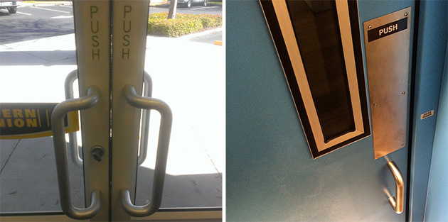
“When a device as simple as a door has to come with an instruction manual—even a one-word manual—then it is a failure,” writes Norman in his classic book “The Design of Everyday Things.” And you’d think designers would know by now that handles suggest pulling and plates suggest pushing. But even when they get that part right, things can still go wrong. Push bars, like those in many emergency exits, are often symmetrical. But which side do you push to get out? You might be able to Encyclopedia Brown your way out of the problem by studying the placement of the hinges, but probably not in a true emergency.

The problem of fixing bad design with instructions goes far beyond doors. Ever have trouble getting the shower to work in a hotel bathroom? Hopefully you’ve never run into anything as bad as what designer Peter Hildebrandt found in a hotelin Sunnyvale, California:

A common problem in web design is how to let users know that they can scroll to see more of a page when you’ve presented them with a graphic or image that takes up the entire initial screen. Some designers are rebelling against the “click here to scroll” label and arrow that many have used to solve this problem:

As UX designer Rodrigo Muniz puts it: “Using an arrow to tell users to scroll a web page is like using ‘click here’ on a button that doesn’t look like one.”
And there’s evidence that these instructions might not even be necessary. Muniz mentions a study by the digital agency HUGE that found that regardless of whether the home page had an arrow at the bottom or not, people scrolled. These are the results for the four designs they looked at:

When faced with a giant image and no hints about what to do next, most users knew to begin scrolling. Even more users – all of them, in fact – scrolled when the giant image was overlaid with a small arrow indicating that scrolling was required. The study saw the same results when the large image was cropped so that a small bit of the rest of the page appeared at the bottom of the browser window.
The New York Times, in a recent interactive graphic, let readers know that they could scroll by showing just the tip of an animated globe. It’s obvious to a reader that the words are just a prologue to the main event, which is an easy scroll away.

The iPhone’s user interface uses this strategy all over the place, dropping hints that there’s more, by adding a tiny sliver of photo or app that peeks out from the side.

Making content feel “cut off” so that people scroll or swipe to see more is a strategy that’s been used and discussed for at least a decade. “By going for that Cut-off look, [designers] might find their users are suddenly happy to scroll,” wrote UX designer Jared Spool back in 2006.
If you find yourself writing copy to solve a design problem, think about whether a new design is what you should really be pursuing.


