Since this time last year, we’ve seen a deadly mine disaster, the worst oil spill in U.S. history, and now a nuclear crisis in Japan. That got us wondering—how does one compare or quantify the human cost of different sources of energy?
As it turns out, a Swiss research organization, the Paul Sherrer Institute, has been doing just that. Using data from the institute, we pulled together a few visualizations.
The top part of the graph shows the actual number of deaths from severe accidents in developed countries from 1970 through 2008. The bottom part of the graph shows the number of deaths that might result from a catastrophic event at an average site in the developed world. This does not show the worst case scenario for any situation, but it gives a sense of the relative risks associated with different sources of energy.
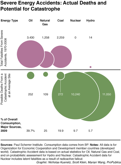
These numbers represent deaths in the developed world from severe accidents only, where at least five people were killed. The accidents have occurred at many stages of the energy supply chain, from coal mining to shipping oil to accidents at actual power plants.
It’s important to note that every-day energy use from fossil fuels kills far more people than accidents. By one estimate from 2000, pollution from power plants results in at least 30,000 premature deaths every year in the United States alone.
We have excluded renewable energy sources because there is a shorter history of their use, because they make up a small percentage of our energy, and because so far they have not shown as great a potential to cause catastrophic damage.
We looked exclusively at the developed world because the great disparity in safety standards between developed and developing countries make them hard to compare. Our chart shows no lethal major accidents at nuclear plants. That’s because the only one was the meltdown at Chernobyl in the then-Soviet Union—not considered a developed country in this study. There have not been any catastrophic dam failures either.
To adjust for this, the Paul Sherrer Institute used projections to estimate what would happen if there were a catastrophic failure at an average site (the models are in Switzerland, but are generally applicable to the developed world). This stuff is complicated, and if you’re still curious about the assumptions behind the Institute’s projections, they’ve told us that they welcome any and all questions, so just ask.


