


There’s a saying among data nerds that every map is the same map.
That’s not literally true, of course, but plenty of social phenomena display similar geographic patterns.
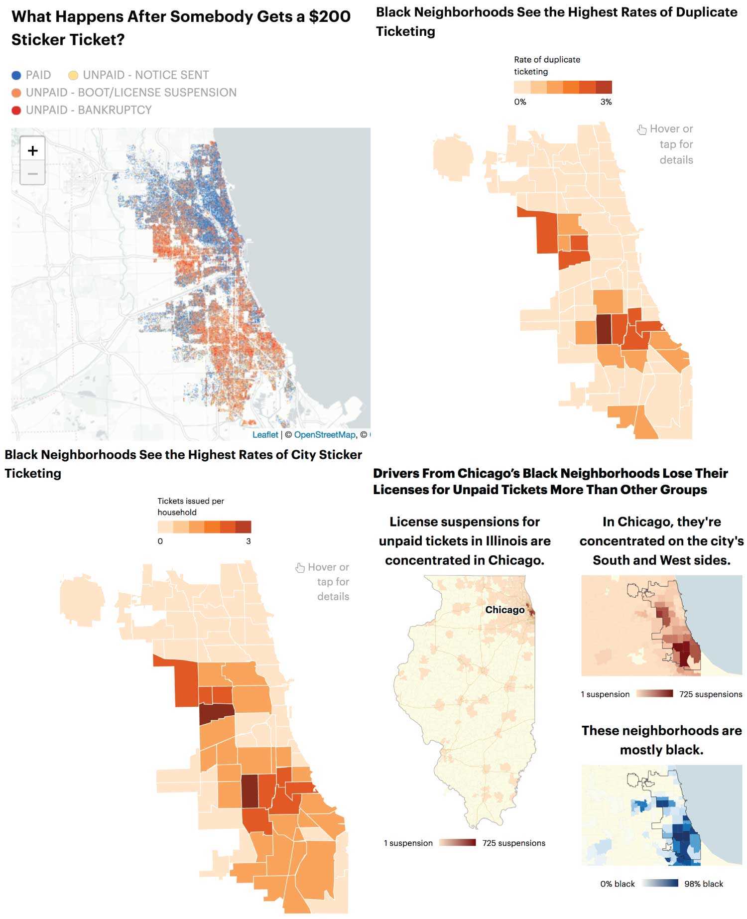
That’s what you’ve seen if you’ve been following our reporting with WBEZ on parking tickets driving poor, black Chicagoans into debt — and even into bankruptcy.
This fact makes maps a double-edged sword. Maps can help us understand the invisible geographies of the world around us and, at the same time, show us what we think we already know, confirming our suspicions without deepening our understanding.
Often, these maps mainly tell us where people live rather than actually showing a geographic trend other than population density.

Crime maps can be particularly problematic — police crime statistics don’t represent all crime, and any individual’s chances of being a crime victim are affected by factors such as age, gender, race and pure circumstance. Yet even the most carefully made crime maps can’t help but say to readers, “Avoid these places,” even when the risks are relatively low.
But just because social problems aren’t surprising doesn’t mean they aren’t worth mapping. Just because maps are similar doesn’t mean they’re actually the same. And just because you’ve seen it many times doesn’t mean you shouldn’t be reminded again of Chicago’s segregation and inequality.
Maps of large-scale phenomena such as the per-household rate of parking tickets issued by the City of Chicago and their outcomes show something new, even if the patterns resemble many others. The almost 16x difference per-household ticketing rates between the most- and least-ticketed Chicago community areas looks a lot like a map of violent crime. But seeing them together helps us ask better questions about those two issues.

Seeing the scale in a map beyond an individual case turns personal anecdotes into evidence. It helps us, as both readers and journalists, understand the magnitude of disparities and how they play out across cities, states and the entire country. Even if you think you’re looking at the same map, keep looking.


