


Grid systems are fundamental to many visual design processes. They govern the spatial relationships in a layout by establishing a set of standard sizes and positions for various elements. In addition to helping achieve a visual harmony between components, they make the design process faster and more efficient and help ensure decisions aren’t made arbitrarily. If you’re reading this post on ProPublica’s website, you’re looking at a page that was built using one.
Grid systems have been used in print for years. But in the digital space proportions are often flexible, not fixed. In modern design, grid systems need to be applied differently across a whole range of devices. If you’re a designer experimenting with different layouts that means doing a lot of math. For those of us working in newsrooms where things move fast, that can be an unacceptable bottleneck.
When we relaunched ProPublica’s website last year we built a tool to make the process faster and easier. It enables rapid prototyping with squeaky-clean code and today we’re making it open source.

Introducing Column Setter
Column Setter is a Sass tool that lets you easily set up a custom responsive grid for your website and build float- and flexbox-based layouts that align to it. It uses one simple function and a small handful of optional mixins, and leaves the structure of your HTML and CSS almost entirely up to you.
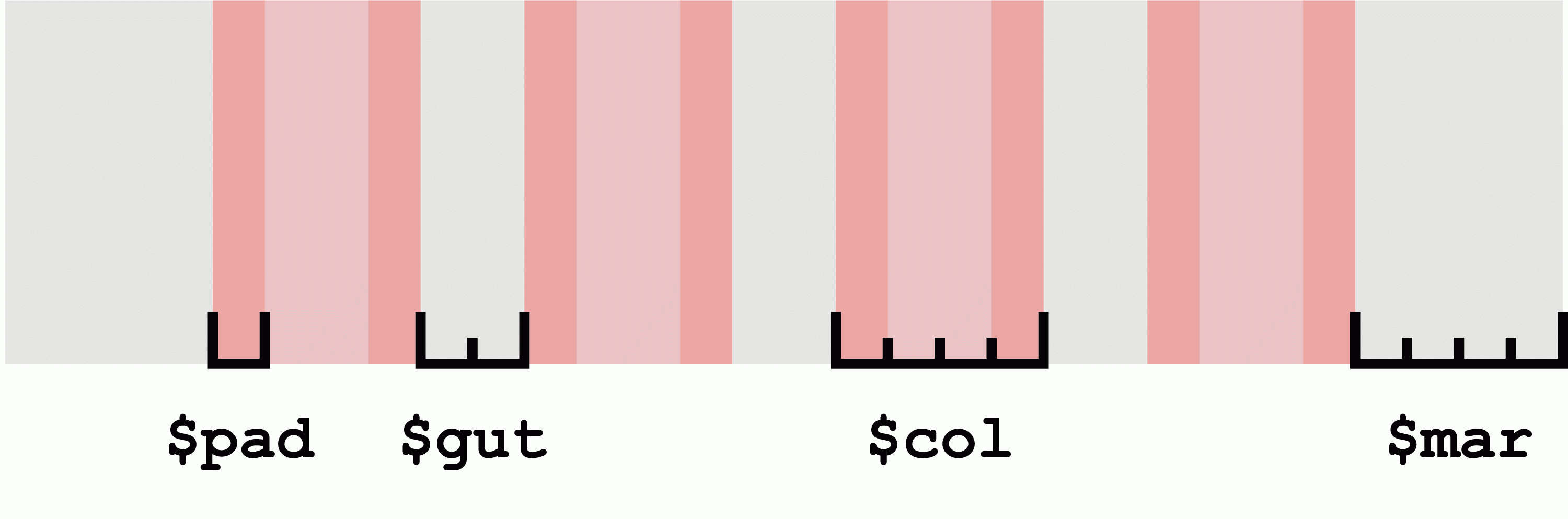
Setup is quick and painless. Begin by editing the four variables at the top of the settings file ($mar, $col, $gut, $pad). These establish the spatial relationships for the outer margin, columns, gutter and padding of your grid.
In the example below, the gutters are twice the width of the padding, the columns are twice the width of the gutters and the outer margins are the same width as the columns.
$mar: 4; // Margin width
$col: 4; // Column width
$gut: 2; // Gutter width
$pad: 1; // Padding width
That gives us a grid that looks a little something like this:
Now define your breakpoints. You do that in the same settings file, giving each breakpoint a name, column count and min-width value for when you want it to trigger:
$breakpoints: (small: ( cols:4, min-width:0 ),medium: ( cols:8, min-width: 30em ),large: ( cols: 12, min-width: 60em )
);
Those few lines of code are all it takes to set up your grid. Now you’re ready to start building a layout!
Apply the grid to any block-level element using the grid() mixin. If, for example, your layout is wrapped by a div with a class of main-content, you can apply the grid to it like so:
@include grid( main-content );This establishes the container’s horizontal margins for each of the breakpoints you added in the settings file. The final CSS output looks something like this:
@media screen and (min-width: 0) {.main-content {margin: 0 13.333333333333333%;}
}
@media screen and (min-width: 30em) {.main-content {margin: 0 7.407407407407407%}
}
@media screen and (min-width: 60em) {.main-content {margin: 0 5.128205128205128%;}
}
grid() also lets you add a handy visual overlay to ensure your layout is lining up correctly to your grid. Just add the optional overlay argument:
@include grid( main-content, overlay );
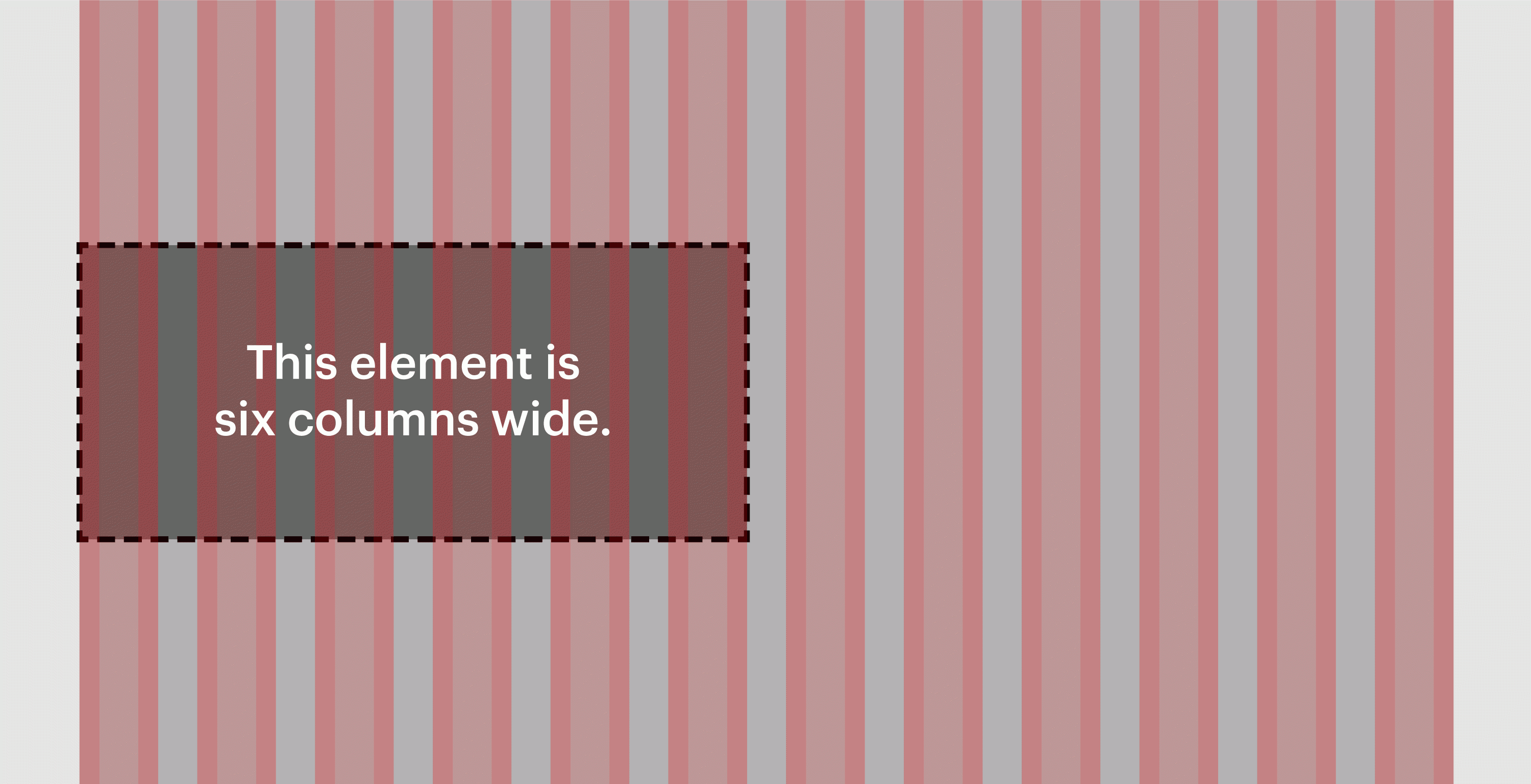
Once your layout’s context is set, it’s colspan()’s time to shine. colspan() is Column Setter’s star player: a function that generates percentage widths that neatly line up with your grid.
To use it on an element in your layout, you’ll need to know how many columns wide the element’s container is. For example, to specify a width of six columns for an element inside a container that’s 12 columns wide:
.example {width: colspan( 6, 12 ); // 6 columns wide out of 12
}
The code above will compile to something like this:
.example {width: 48.571428571428571%;
}
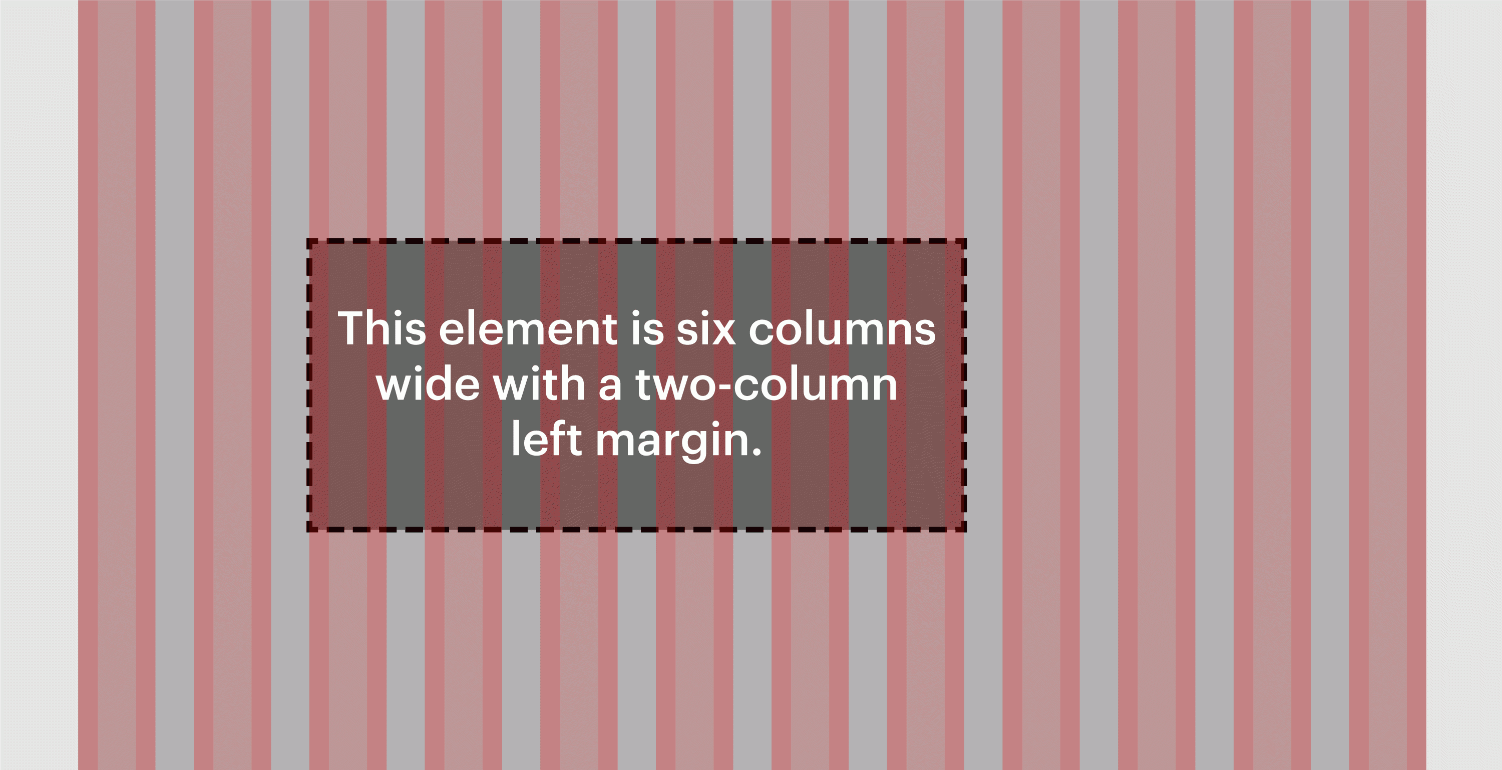
What if you want to move that element over two columns? You’ll need to give it a left margin that spans two columns and an additional gutter. To do that, add two colspan() calls together:
.example {width: colspan( 6, 12 );// 6 columns wide out of 12margin-left: colspan( 2, 12 ) + colspan( g, 12 ); // 2 columns and a gutter
}
Our new code compiles to:
.example {width: 48.571428571428571%;margin-left: 17.142857142857143%;
}
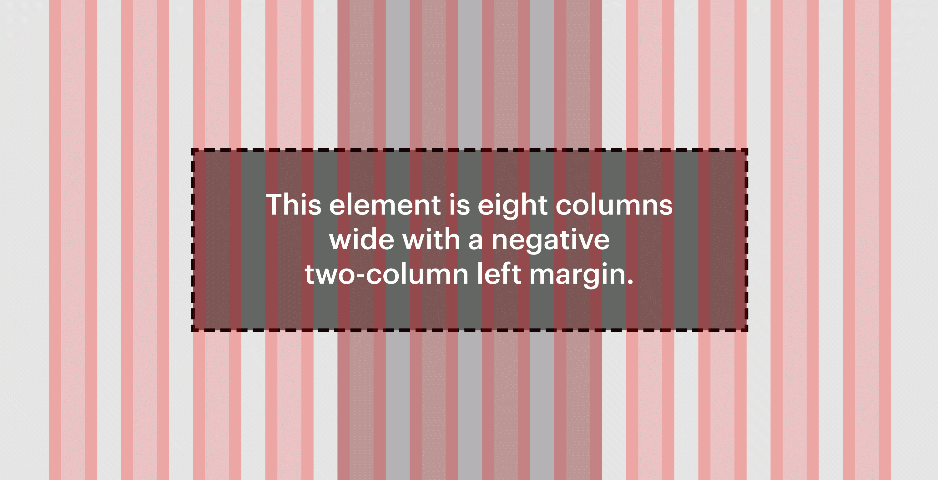
Now, just because you’re working within a container of a certain size doesn’t mean you have to let that constrain you. Let’s say you want an element to be eight columns wide and centered, even though its container is only four columns wide. No problem!
.example {width: colspan( 8, 4 ); // 8 columns wide out of 4margin-left: -( colspan( 2, 4 ) + colspan( g, 4 ) ); // Negative margin of 2 columns and a gutter
}
Here’s the code that generates:
.example {width: 209.090909090909091%;margin-left: -54.545454545454545%;
}
Now that you’ve got a handle on sizing and positioning elements in your layout using colspan(), let’s look at how to make that layout responsive using the breakpoint-min() mixin.
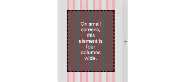
Remember the settings we established earlier? The grid has three breakpoints named small, medium and large. They contain four, eight and 12 columns. Let’s center an element in the layout and make it four columns wide at the small breakpoint, six columns wide at the medium breakpoint and eight columns wide at the large breakpoint.
.example {@include breakpoint-min( small ) {width: colspan( 4, 4 ); // 4 columns wide out of 4margin: 0 auto; // Horizontally center the element}@include breakpoint-min( medium ) {width: colspan( 6, 8 ); // 6 columns wide out of 8}@include breakpoint-min( large ) {width: colspan( 8, 12 ); // 8 columns wide out of 12}
}
Our final example compiles like so:
@media screen and (min-width: 0) {.example {width: 100%;margin: 0 auto;}
@media screen and (min-width: 30em) {.example {width: 73.91304347826087%;}
@media screen and (min-width: 60em) {.example {width: 65.714285714285714%;}
}
What about CSS Grid?
Column Setter does a lot of stuff that’s quickly becoming the domain of CSS Grid Layout. Browser support and developer adoption of CSS Grid are growing by the day, but sites that need sophisticated layout options in older browsers can’t use it just yet. For those cases, Column Setter has got you covered.
Download Column Setter from our GitHub repository and get started. You can even log issues, review the code and contribute pull requests.


