


If you’re trying to make your fixed-width site adaptive, there are some things you need to know about the viewport tag.
If you don’t know what viewport is, there are some excellent developer guides on the web that will catch you up. Peter Paul Koch has a great technical primer on using viewport with media queries, and Apple’s documentation on how viewport works on Mobile Safari is quite detailed and clearly written.
Briefly, viewport is a meta tag that was created by Apple to give web developers control over the behavior of the layout viewport in Mobile Safari. Imagine the layout viewport as a little window that is as big as your mobile device’s screen. When you scroll around a page in Mobile Safari, you’re actually moving that little window around a larger web page. Likewise, by “pinching” the screen, you’re really setting the zoom level of the window relative to the page behind it.
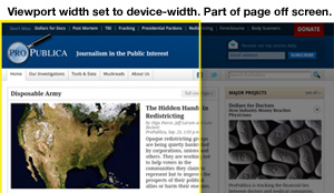
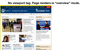
Viewport isn’t actually a true standard, but other mobile browser vendors support it, though not without some quirks. The part we’re talking about here generally behaves the same in most mobile browsers: When you set your viewport width to device-width, it disables “overview mode,” which is the behavior whereby the larger web page fits inside the viewport window and everything is very zoomed out until you pinch open or double click on parts of the page.
That’s just fine if you’ve got a fully responsive, fluid-width site, which stretches or shrinks to the full width of the screen no matter what the screen size is set to. But that’s not at all what ProPublica has. We’ve got a pretty traditional fixed-width site, with a single adaptive “break” for a mobile screen. On our site, smartphones get a full-width 320 pixel-wide page, and desktop browsers see the full 960 pixel-wide page.
In all of our testing, everything looked great — until we spent some time testing on tablets. Because we set the viewport width to device-width so the media queries would work their magic on narrow screens, tablets simply disabled overview mode and loaded our pages at their full desktop width. The tablet screens showed as much of our pages as they could and hid the rest. The Kindle Fire (device-width: 600px) was particularly forlorn, and the iPad (device-width: 768px) showed some elements in overview mode but somehow set background images to the wrong size, with unspeakable results.
We liked overview mode on tablets, so after trying a few things, we hit upon a workable solution: In order to restore the old overview mode behavior, we created a media query for each tablet we wanted to target and used CSS zoom to shrink the page to fit when it first loads.
Rather than using the width media query, we used device-width so that the styles would only be applied if the screen was a given size, not just the browser window. That way we weren’t applying a new set of styles when people’s browser windows happened to be open to a certain size.
To get the zoom value we simply divided the apparent device width by our optimal width (985px), and multiplied by 100. Like so:
<meta name="viewport" content="width=device-width">
<style>
  /* Samsung Galaxy */
  @media screen and (device-width: 800px) { html { zoom: 81.21827%; } }
  /* Kindle Fire */
  @media screen and (device-width: 600px) { html { zoom: 60.91370%; } }
  /* iPad */
  @media screen and (device-width: 768px) { html { zoom: 77.96954%; } }
</style>
But, but…
Sure, we could have done this via JavaScript and made it more dynamic. You can target viewport in WebKit browsers, and we suspect changing initial-scale would do as good a job as our CSS zoom technique. But there would have been a visible flash after the page has rendered, which we wanted to avoid.
Also, as SASS converts, we thought to make a SASS mixin out of this, but we discovered that SASS doesn’t allow variable interpolation in the @media directive. So for now we’ll need to have a media query for each tablet screen width. Not ideal but not the end of the world by far.
By passing along our solution we’re hoping that either somebody way smarter than us will see a more elegant or effective fix, or somebody hitting the same problem will find this solution helpful.
Portvie.ws
We made a very simple web page you can use with devices you’re testing. It displays what the handset thinks the layout viewport dimensions and screen width are. Go crazy: www.portvie.ws


