Millions of motorists in Chicago have gotten a parking ticket. So when we built The Ticket Trap — an interactive news application that lets people explore ticketing patterns across the city — we knew that we’d be building something that shines a spotlight on an issue that affects people from all walks of life.
But we had a more specific story we needed to tell.
At ProPublica Illinois, we’d been reporting on Chicago’s aggressive parking and vehicle compliance ticket system for months. Our stories revealed a system that disproportionately punishes black and low-income residents and generates millions of dollars every year for the city by pushing massive debt onto Chicago’s poorest residents — even sending thousands into bankruptcy.
So when we thought about building an interactive database that allows the public, for the first time, to see all 54 million tickets issued over the last two decades, we wanted to make sure users understood the findings of the overall project. That’s why we centered the user experience around the disparities in the system, such as which wards have the most ticket debt and which have been hit hardest because residents can’t pay.
The Ticket Trap is a way for users to see lots of different patterns in tickets and to see how their wards fit into the bigger picture. It also gives civically active folks tools for talking about the issue of fines imposed by the city and helps them hold their elected officials accountable for how the city imposes debt.
The project also gave us an opportunity to try a bunch of technical approaches that could help a small organization like ours develop sustainable news apps. Although we’re part of the larger ProPublica, I’m the only developer in the Illinois office, so I want to make careful choices that will help keep our “maintenance debt” — the amount of time future-me will need to spend keeping old projects up and running — low.
Managing and minimizing maintenance debt is particularly important to small organizations that hope to do ambitious digital work with limited resources. If you’re at a small organization, or are just looking to solve similar problems, read on: These tools might help you, too.
In addition to lowering maintenance debt, I also wanted the pages to load quickly for our readers and to cost us as little as possible to serve. So I decided to eliminate, as much as possible, having executable code running on a server just to load pages that rarely change. That decision required us to solve some problems.
The development stack was JAMstack, which is a static front-end client with microservices to handle the dynamic features.
The learning curve for these technologies is steep (don’t worry if you don’t know what it all means yet). And while there are lots of good resources to learn the components, it can still be challenging to put them all together.
So let’s start with how we designed the news app before descending into the nerdy lower decks of technical choices.
Design Choices
The Ticket Trap focuses on wards, Chicago’s primary political divisions and the most relevant administrative geography. Aldermen don’t legislate much, but they have more power over ticketing, fines, punishments and debt collection policies than anyone except the mayor.
We designed the homepage as an animated, sortable list that highlights the wards, instead of a table or citywide map. Our hope was to encourage users to make more nuanced comparisons among wards and to integrate our analysis and reporting more easily into the experience.
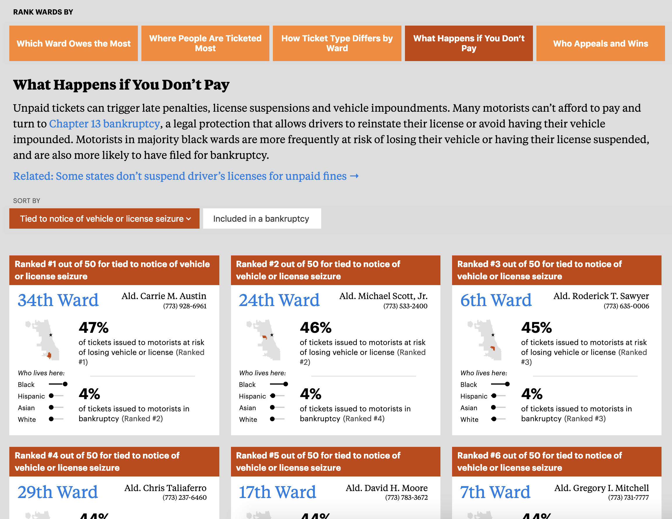
The top of the interface provides a way to select different topics and then learn about what they mean and their implications before seeing how the wards compare. If you click on “What Happens if You Don’t Pay,” you’ll learn that unpaid tickets can trigger late penalties, but they can also lead to license suspensions and vehicle impoundments. Even though many people from vulnerable communities are affected by tickets in Chicago, they’re not always familiar with the jargon, which puts them at a disadvantage when trying to defend themselves. Empowering them by explaining some basic concepts and terms was an important goal for us.
Below the explanation of terms, we display some small cards that show you the location of each ward, the alderman who represents it, its demographic makeup and information about the selected topic. The cards are designed to be easy to “skim and dive” and to make visual comparisons. You can also sort the cards based on what you’d like to know.
We included some code in our pages to help us track how many people used different features. About 50 percent of visitors selected a new category at least once and 27 percent sorted once they were in a category. We’d like to increase those numbers, but it’s in line with engagement patterns we saw for our Stuck Kids interactive graphic and better than we did on the interactive map in The Bad Bet, so I consider it a good start.
For more ward-specific information, readers can also click through to a page dedicated to their ward. We show much of the same information as the cards but allow you to home in on exactly how your ward ranks in every category. We also added some more detail, such as a map showing where every ticket in your ward has been issued.
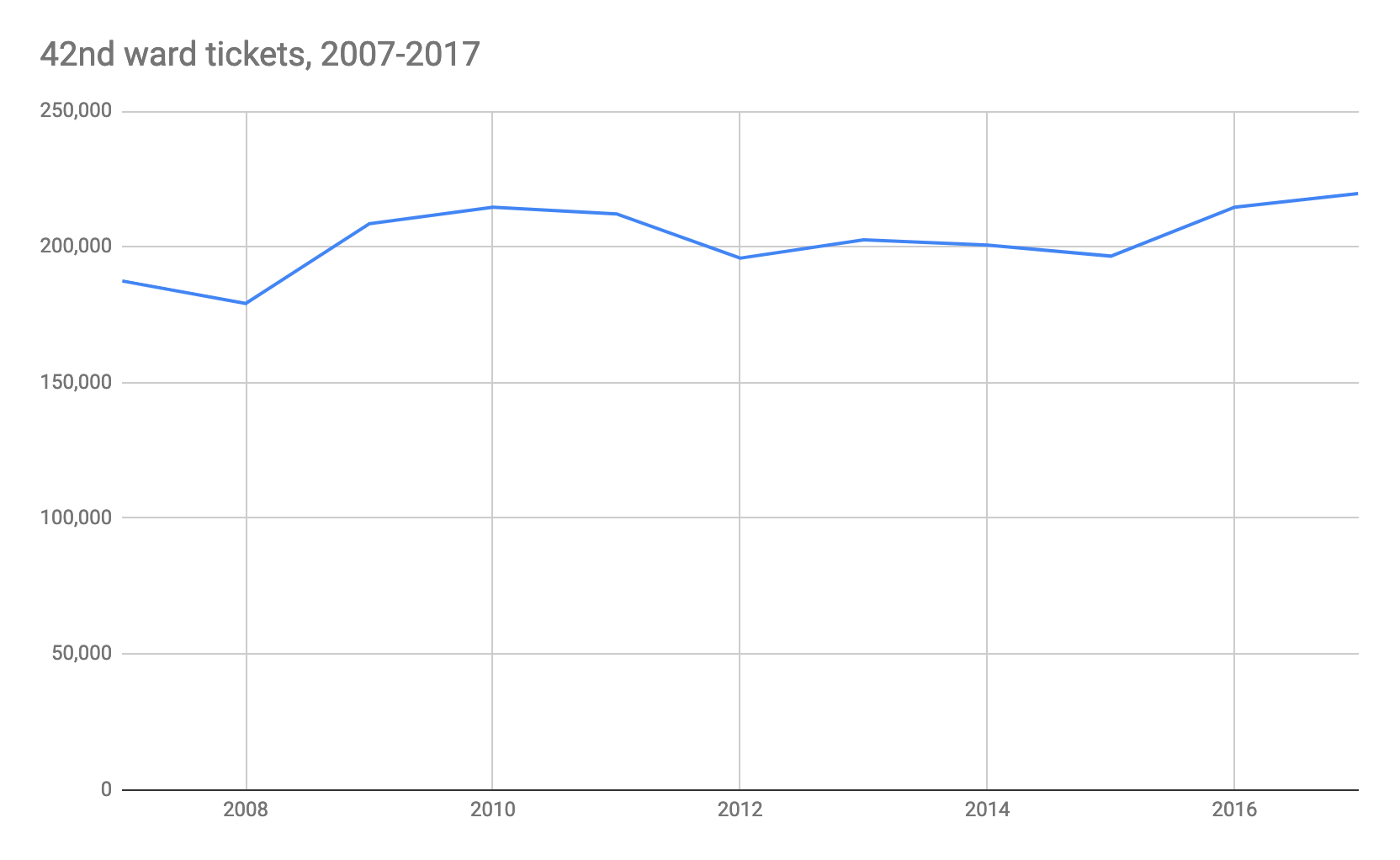
We decided against showing trends over time on ward pages because the overall trend in the number of tickets issued is too big and complex a subject to capture in simple forms like line charts. As interesting as that may have been, it would have been outside the journalistic goals of highlighting systemic injustices.
For example, here’s the trend over time for tickets in the 42nd Ward (downtown Chicago). It’s not very revealing. Is there an upward trend? Maybe a little. But the chart says little about the overall effect of tickets on people’s lives, which is what we were really after.
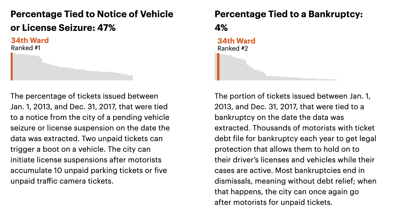
On the other hand, the distributions of seizures/suspensions and bankruptcy are very revealing and show clear groupings and large variance, so each detail page includes visualizations of these variables.
Looking forward, there’s more we can do with these by layering on more demographic information and adding visual emphasis.
One last point about the design of these pages: I’m not a “natural” designer and look to colleagues and folks around the industry for inspiration and help. I made a map of some of those influences to show how many people I learned from as I worked on the design elements:
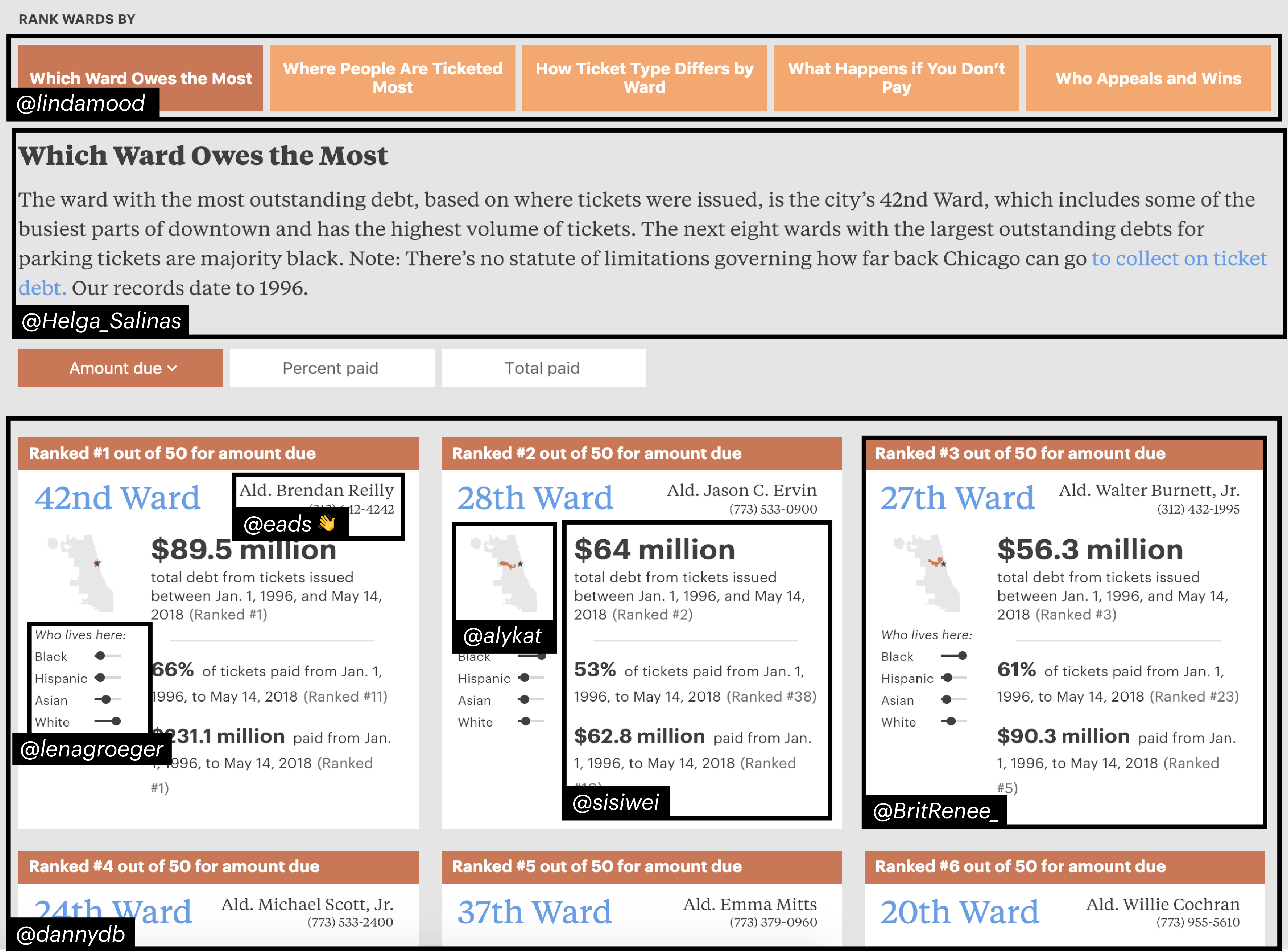
These include ProPublica news applications developer Lena Groeger’s work on Miseducation, as well as NPR’s Book Concierge, first designed by Danny DeBelius and most recently by Alice Goldfarb. I worked on both and picked up some design ideas along the way. Helga Salinas, then an engagement reporting fellow at ProPublica Illinois, helped frame the design problems and provided feedback that was crucial to the entire concept of the site.
Technical Architecture
The Ticket Trap is the first news app at ProPublica to take this approach to mixing “baked out” pages with dynamic features like search. It’s powered by a static site generator (GatsbyJS), a query layer (Hasura), a database (Postgres with PostGIS) and microservices (Serverless and Lambda).
Let’s break that down:
- Front-end and site generator: GatsbyJS builds a site by querying for data and providing it to templates built in React that handle all display-layer logic, both the user interface and content.
- Deployment and development tools: A simple Grunt-based command line interface for deploying and administrative tasks.
- Data management: All data analysis and processing is done in Postgres. Using GNU Make, the database can be rebuilt at any time. The Makefile also builds map tiles and uploads them to Mapbox. Hasura provides a GraphQL wrapper around Postgres so that GatsbyJS can query it, and GraphQL is just a query language for APIs.
- Search and dynamic services: Search is handled by a simple AWS Lambda function managed with Serverless that ferries simple queries to an RDS database.
It’s all a bit buzzword-heavy and trendy-sounding when you say it fast. The learning curve can be steep, and there’s been a persistent and sometimes persuasive argument that the complexity of modern Javascript toolchains and frameworks like React are overkill for small teams.
We should be skeptical of the tech du jour. But this mix of technologies is the real deal, with serious implications for how we do our work. I found that once I could put all the pieces together, there was significantly less complexity than when using MVC-style frameworks for news apps, in my view.
Front End and Site Generator
GatsbyJS provides data to templates (built as React components) that contain both UI logic and content.
The key difference here from frameworks like Rails is that instead of splitting up templates and the UI (the classic “change template.html then update app.js” pattern), GatsbyJS bundles them together using React components. In this model, you factor your code into small components that bundle data and interactivity together. For example, all the logic and interface for the address search is in a component called AddressSearch. This component can be dropped into the code anywhere we want to show an address search using an HTML-like syntax (<AddressSearch />) or even used in other projects.
We’ll skip over what I did here, which is best summed up by this Tweet:
There are better ways to learn React than my subpar code.
GatsbyJS also gives us a uniform system for querying our data, no matter where it comes from. In the spirit of working backward, look at this simplified query snippet from the site’s homepage, which provide access to data about each ward’s demographics, ticketing summary data, responsive images with locator maps for each ward, site configuration and editable snippets of text from a Google spreadsheet.
export const query = graphql` query PageQuery { configYaml { slug title description } allImageSharp { edges { node { fluid(maxWidth: 400) { …GatsbyImageSharpFluid } } } } allGoogleSheetSortbuttonsRow { edges { node { slug label description } } } iltickets { citywideyearly_aggregate { aggregate { sum { current_amount_due ticket_count total_payments } } } wards { ward wardDemographics { white_pct black_pct asian_pct latino_pct } wardMeta { alderman address city state zipcode ward_phone email } wardTopFiveViolations { violation_description ticket_count avg_per_ticket } wardTotals { current_amount_due current_amount_due_rank ticket_count ticket_count_rank dismissed_ticket_count dismissed_ticket_count_rank dismissed_ticket_count_pct dismissed_ticket_count_pct_rank … } } }
Seems like a lot, and maybe it is. But it’s also powerful, because it’s the precise shape of the JSON that will be available to our template, and it draws on a variety of data sources: A YAML config file kept under version control (configYAML), images from the filesystem processed for responsiveness (allImageSharp), edited copy from Google Sheets (allGoogleSheetSortbuttonsRow) and ticket data from PostgreSQL (iltickets).
And data access in your template becomes very easy. Look at this snippet:
iltickets { wards { ward wardDemographics { white_pct black_pct asian_pct latino_pct } } }
In our React component, accessing this data looks like:
{data.iltickets.wards.map( (ward, i) => (
Ward {ward.ward} is {ward.wardDemographics.latino_pct}% Latino.
Every other data source works exactly the same way. The simplicity and consistency help keep templates clean and clear to read.
Behind the scenes, Hasura, a GraphQL wrapper for Postgres, is stitching together relational database tables and serializing them as JSON to pull in the ticket data.
Data Management
Hasura
Hasura occupies a small role in this project, but without it, the project would be substantially more difficult. It’s the glue that lets us build a static site out of a large database, and it allows us to query our Postgres database with simple JSON-esque queries using GraphQL. Here’s how it works.
Let’s say I have a table called “wards” with a one-to-many relationship to a table called “ward_yearly_totals”. Assuming I’ve set up the correct foreign key relationships in Postgres, a query from Hasura would look something like:
wards { ward alderman wardYearlyTotals { year ticket_count } }
On the back end, Hasura knows how to generate the appropriate join and turn it into JSON.
This process was also critical in working out the data structure. I was struggling with this but I realized that I just needed to work backward. Because GraphQL queries are declarative, I simply wrote queries that described the way I wanted the data to be structured for the front end and worked backward to create the relational database structures to fulfill those queries.
Hasura can do all sorts of neat things, but even the most simple use case — serializing JSON out of a Postgres database — is quite compelling for daily data journalism work.
Data Loading
GNU Make powers the data loading and processing workflow. I’ve written about this before if you want to learn how to do this yourself.
There’s a Python script (with tests) that handles cleaning up unescaped quotes and a few other quirks of the source data. We also use the highly efficient Postgres COPY command to load the data.
The only other notable wrinkle is that our source data is split up by year. That gives us a nice way to parallelize the process and to load partial data during development to speed things up.
At the top of the Makefile, we have these years:
PARKINGYEARS = 1996 1997 1998 1999 2000 2001 2002 2003 2004 2005 2006 2007 2008 2009 2010 2011 2012 2013 2014 2015 2016 2017 2018
To load four years worth of data, processing in parallel across four processor cores looks like this:
PARKINGYEARS=”2015 2016 2017 2018″ make -j 4 parking
Make, powerful as it is for filesystem-based workflows and light database work, has been more than a bit fussy when working so extensively with a database. Dependencies are hard to track without hacks, which means not all steps can be run without remembering and running prior steps. Future iterations of this project would benefit from either more clever Makefile tricks or a different tool.
However, being able to recreate the database quickly and reliably was a central tenet of this project, and the Makefile did just that.
Analysis and Processing for Display
To analyze the data and deliver it to the front end, we wrote a ticket loader (open sourced here) to use SQL queries to generate a series of interlinked views of the data. These techniques, which I learned from Joe Germuska when we worked together at the Chicago Tribune, are a very powerful way of managing a giant data set like the 54 million rows of parking ticket data used in The Ticket Trap.
The fundamental trick to the database structure is to take the enormous database of tickets and crunch it down into smaller tables that aggregate combinations of variables, then run all analysis against those tables.
Let’s take a look at an example. The query below groups by year and ward, along with several other key variables such as violation code. By grouping this way, we can easily ask questions like, “How many parking meter tickets were issued in the 3rd Ward in 2005?” Here’s what the summary query looks like:
create materialized view wardsyearly as select w.ward, p.violation_code, p.ticket_queue, p.hearing_disposition, p.year, p.unit_description, p.notice_level, count(ticket_number) as ticket_count, sum(p.total_payments) as total_payments, sum(p.current_amount_due) as current_amount_due, sum(p.fine_level1_amount) as fine_level1_amount from wards2015 w join blocks b on b.ward = w.ward join geocodes g on b.address = g.geocoded_address join parking p on p.address = g.address where g.geocode_accuracy > 0.7 and g.geocoded_city = ‘Chicago’ and ( g.geocode_accuracy_type = ‘range_interpolation’ or g.geocode_accuracy_type = ‘rooftop’ or g.geocode_accuracy_type = ‘intersection’ or g.geocode_accuracy_type = ‘point’ or g.geocode_accuracy_type = ‘ohare’ ) group by w.ward, p.year, p.notice_level, p.unit_description, p.hearing_disposition, p.ticket_queue, p.violation_code;
The virtual table created by this view looks like this:
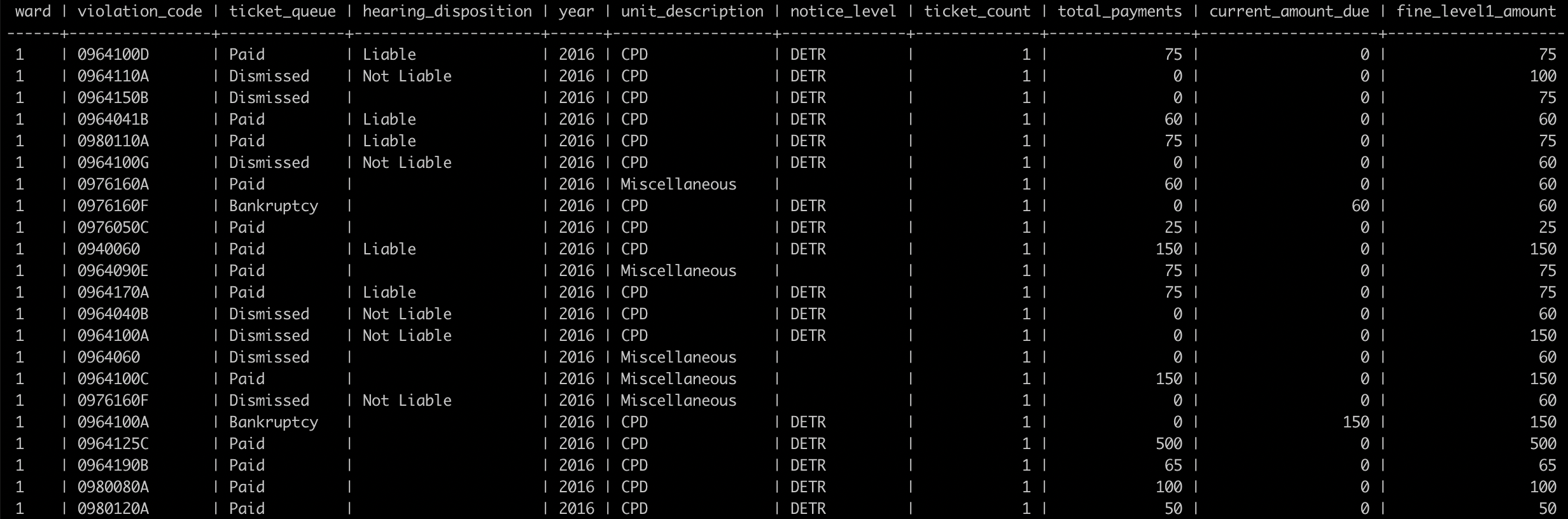
This is very easy to query and reason about, and significantly faster than querying the full parking data set.
Let’s say we want to know how many tickets were issued by the Chicago Police Department in the 1st Ward between 2013 and 2017:
select sum(ticket_count) as cpd_tickets from wardsyearly where ward = ‘1’ andyear >= 2013 and year <= 2017 and unit_description = ‘CPD’
The answer is 64,124 tickets. This query took 119 milliseconds on my system when I ran it, while a query to obtain the equivalent data from the raw parking records takes minutes rather than fractions of a second.
The Database as the “Single Source of Truth”
I promised myself when I started this project that all calculations and analysis would be done with SQL and only SQL. That way, if there’s a problem with the data in the front end, there’s only one place to look, and if there’s a number displayed in the front end, the only transformation it undergoes is formatting. There were moments when I wondered if this was crazy, but it has turned out to be perhaps my best choice in this project.
With common table expressions (CTE), part of most SQL environments, I was able to do powerful things with a clear, if verbose, syntax. For example, we rank and bucket every ward by every key metric in the data. Without CTEs, this would be a task best accomplished with some kind of script with gnarly for-loops or impenetrable map/reduce functions. With CTEs, we can use impenetrable SQL instead! But at least our workflow is declarative and ensures any display of the data can and should contain no additional data processing.
Here’s an example of a CTE that ranks wards on a couple of variables using the intermediate summary view from above. Our real queries are significantly more complex, but the fundamental concepts are the same:
with year_bounds as ( select 2013 as min_year, 2017 as max_year ), wards_toplevel as ( select ward, sum(ticket_count) as ticket_count, sum(total_payments) as total_payments, from wardsyearly, year_bounds where (year >= min_year and year <= max_year) group by ward ) select ward, ticket_count, dense_rank() over (order by ticket_count desc) as ticket_count_rank, total_payments, dense_rank() over (order by total_payments desc) as total_payments_rank from wards_toplevel;
Geocoding
Geocoding the data — turning handwritten or typed addresses into latitude and longitude coordinates — was a critical step in our process. The ticket data is fundamentally geographic and spatial. Where a ticket is issued is of utmost importance for analysis. Because the input addresses can be unreliable, the address data associated with tickets was exceptionally messy. Geocoding this data was a six-month, iterative process.
An important technique we use to clean up the data is very simple. We “normalize” the addresses to the block level by turning street numbers like “1432 N. Damen” into “1400 N. Damen.”This gives us fewer addresses to geocode, which made it easier to repeatedly geocode some or all of the addresses. The technique doesn’t improve the data quality itself, but it makes the data significantly easier to work with.
Ultimately, we used Geocodio and were quite happy with it. Google’s geocoder is still the best we’ve used, but Geocodio is close and has a more flexible license that allowed us to store, display and distribute the data, including in our Data Store.
We found that the underlying data was hard to manually correct because many of the errors were because of addresses that were truly ambiguous. Instead, we simply accepted that many addresses were going to cause problems. We omitted addresses that Geocodio wasn’t confident about or couldn’t pinpoint with enough accuracy. We then sampled and tested the data to find the true error rate.
About 12 percent of addresses couldn’t be used. Of the remaining addresses, sampling showed them to be about 94 percent accurate. The best we could do was make the most conservative estimates and try to communicate and disclose this clearly in our methodology.
To improve accuracy, we worked with Matt Chapman, a local civic hacker, who had geocoded the addresses without normalization using another service called SmartyStreets. We shared data sets and cross-validated our results. SmartyStreets’ accuracy was very close to Geocodio’s. I attempted to see if there was a way to use results from both services. Each service did well and struggled with different types of address problems, so I wanted to know if combining them would increase the overall accuracy. In the end, my preliminary experiments revealed this would be technically challenging with negligible improvement.
Deployment and Development Tools
The rig uses some simple shell commands to handle deployment and building the database. For example:
make all make db
grunt publish
grunt unpublish
grunt publish --target=production
Dynamic Search With Microservices
Because we were building a site with static pages and no server runtime, we had to solve the problem of offering a truly dynamic search feature. We needed to provide a way for people to type in an address and find out which ward that address is in. Lots of people don’t know their own wards or aldermen. But even when they do, there’s a decent chance they wouldn’t know the ward for a ticket they received elsewhere in the city.
To allow searching without needing to spin up any new services, we used Mapbox’s autocomplete geocoder, AWS Lambda, to provide a tiny API, our Amazon Aurora database and Serverless to manage the connection.
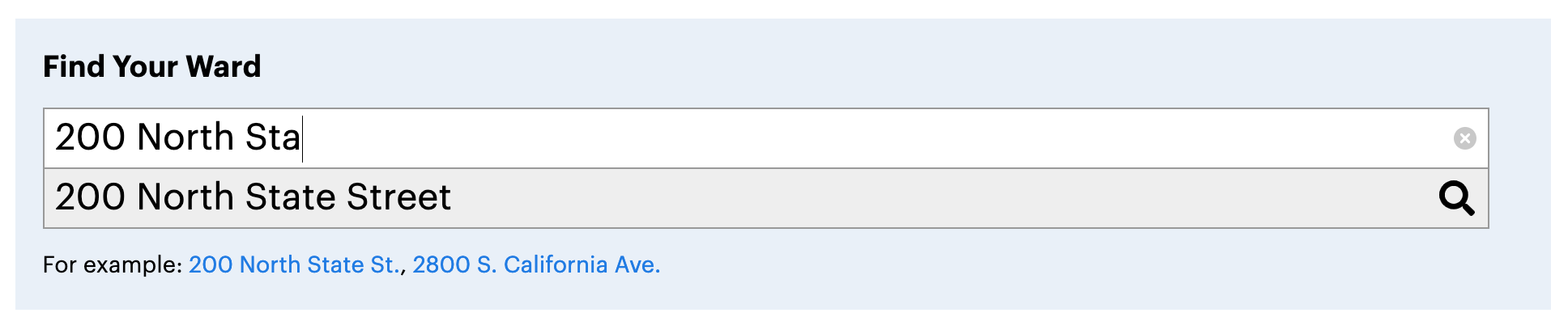
Mapbox provides suggested addresses, and when the user clicks on one, we dispatch a request to the back-end service with the latitude and longitude, which are then run through a simple point-in-polygon query to determine the ward.
It’s simple. We have a serverless.yml config file that looks like this:
service: il-tickets-query
plugins:- serverless-python-requirements- serverless-dotenv-plugincustom:pythonRequirements:dockerizePip: non-linuxzip: trueprovider:name: awsruntime: python3.6stage: ${opt:stage,'dev'}environment:ILTICKETS_DB_URL: ${env:ILTICKETS_DB_URL}vpc:securityGroupIds:- sg-XXXXXsubnetIds:- subnet-YYYYY
package:exclude:- node_modules/**functions:ward:handler: handler.wardevents:- http:method: getcors: truepath: wardrequest:parameters:querystrings:lat: truelng: true
Then we have a handler.py file to execute the query:
try: import unzip_requirements except ImportError: pass
import json
import logging
import numbers
import os
import recordslog = logging.getLogger()
log.setLevel(logging.DEBUG)DB_URL = os.getenv('ILTICKETS_DB_URL')def ward(event, context):qs = event["queryStringParameters"]db = records.Database(DB_URL)rows = db.query("""selectwardfrom wards2015wherest_within(st_setsrid(ST_GeomFromText('POINT(:lng :lat)'), 3857), wkb_geometry)""", lat=float(qs['lat']), lng=float(qs['lng']))wards = [row['ward'] for row in rows]if len(wards):response = {"statusCode": 200,"body": json.dumps({"ward": wards[0]}),"headers": {"Access-Control-Allow-Origin": "projects.propublica.org",}}else:response = {"statusCode": 404,"body": "No ward found",}return response
That’s all there is to it. There are plenty of ways it could be improved, such as making the cross-origin resource sharing policies configurable based on the deployment stage. We’ll also be adding API versioning soon to make it easier to maintain different site versions.
Minimizing Costs, Maximizing Productivity
The cost savings of this approach can be significant.
Using Amazon Lambda cost pennies per month (or less), while running even the smallest servers on Amazon’s Elastic Compute Cloud service usually costs quite a bit more. The thousands of requests and tens of thousands of milliseconds of computing time used by the app in this example are, by themselves, well within Amazon’s free tier. Serving static assets from Amazon’s S3 service also costs only pennies per month.
Hosting costs are a small part of the puzzle, of course — developer time is far more costly, and although this system may take longer up front, I think the trade-off is worth it because of the decreased maintenance burden. The time a developer will not have to spend maintaining a Rails server is time that he or she can spend reporting or writing new code.
For The Ticket Trap app, I only need to worry about a single, highly trusted and reliable service (our database) rather than a virtual server that needs monitoring and could experience trouble.
But where this system really shines is in its increased resiliency. When using traditional frameworks like Rails or Django, functionality like search and delivering client code are tightly coupled. So if the dynamic functionality breaks, the whole site will likely go down with it. In this model, even if AWS Lambda were to experience problems (which would likely be part of a major, internet-wide event), the user experience would be degraded because search wouldn’t work, but we wouldn’t have a completely broken app. Decoupling the most popular and engaging site features from an important but less-used feature minimizes the risks in case of technical difficulties.
If you’re interested in trying this approach, but don’t know where to begin, identify what problem you’d like to spend less time on, especially after your project is launched. If running databases and dynamic services is hard or costly for you or your team, try playing with Serverless and AWS Lambda or a similar provider supported by Serverless. If loading and checking your data in multiple places always slows you down, try writing a fast SQL-based loader. If your front-end code is always chaotic by the end of a development cycle, look into implementing the reactive pattern provided by tools like React, Svelte, Angular, Vue or Ractive. I learned each part of this stack one at a time, always driven by need.