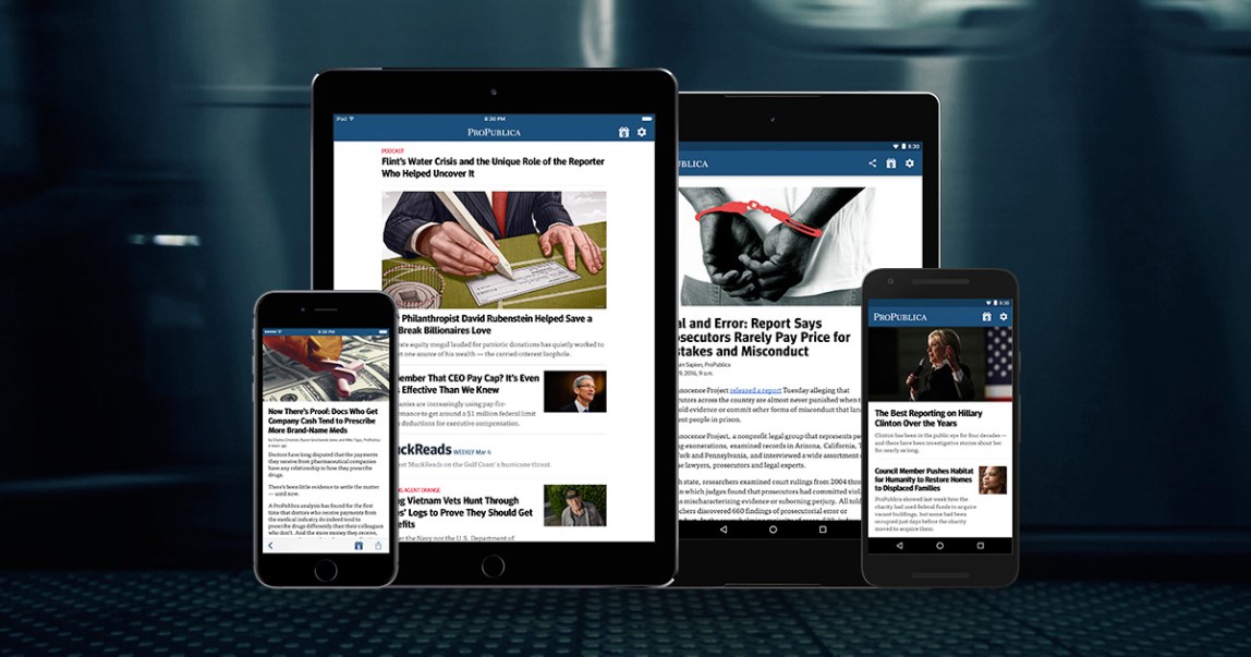
A few weeks ago, ProPublica rolled out new versions of our app for iOS and Android. (If you haven’t tried them yet, stop reading this and go download them immediately!) Rebuilt and redesigned from scratch, they’re the result of a fundamental rethink that kicked off late last year.
Our work was guided by two key questions: 1) How do we build a modern, genuinely useful experience for our most active users, and; 2) how do we maintain it without creating a pile of new work for ourselves?
To answer both questions, we shifted the app’s key organizing principle from completeness to timeliness.
Our previous apps were essentially replicas of our website. Peppered with navigation for all of our major channels, features and archives, they offered deep access and a bunch of different ways to get at it. But heavy nav hierarchies obscured recent and relevant stories — precisely the stuff our most active readers are interested in.
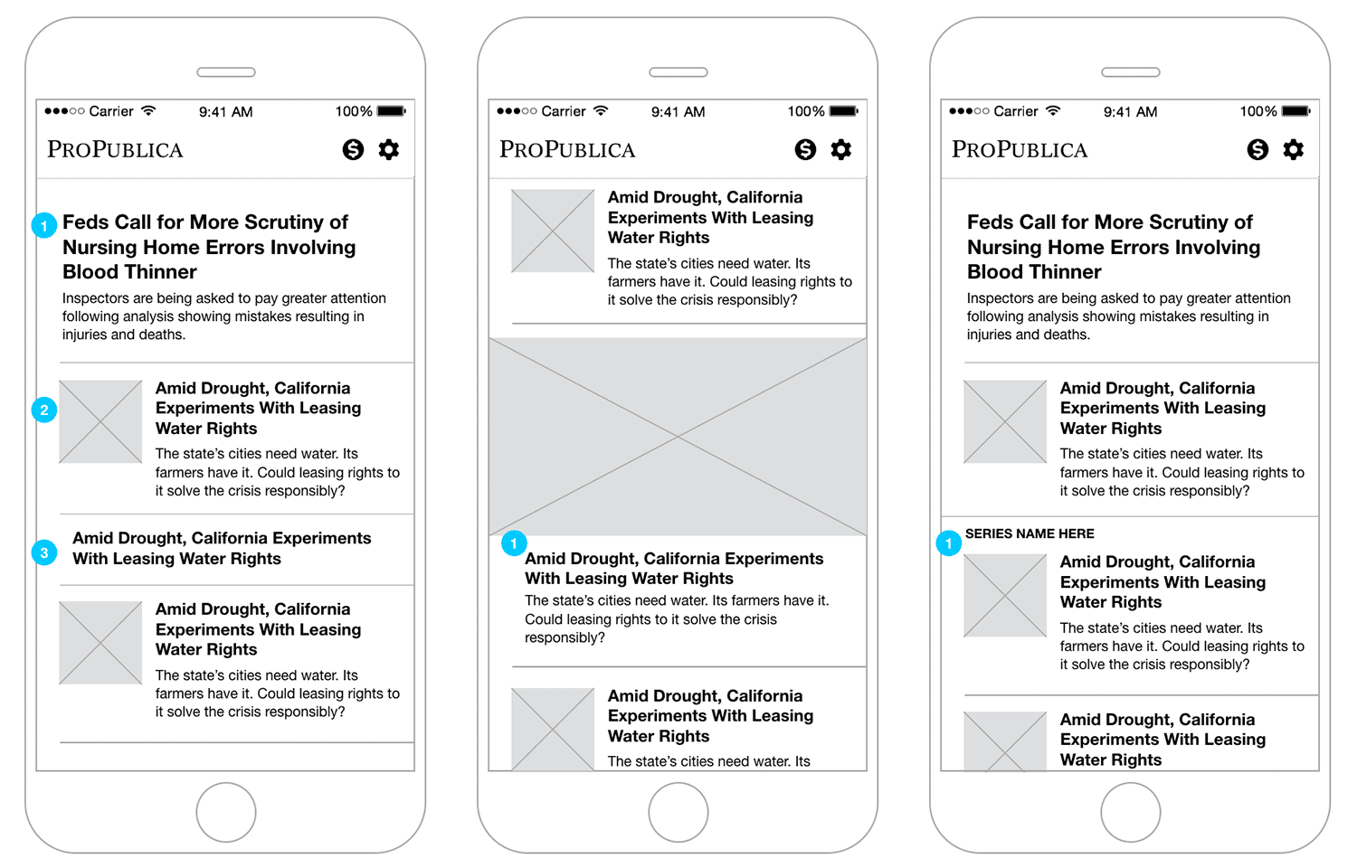
After a little sketching and wireframing, we quickly arrived at a new home screen design built around a simple stream. (“Stream” being the current term of art for a reverse chronological list of things.) It puts the new stuff front and center and pares down the complexity we need to support it. Subsections, archives, and all their associated back-end tools were axed.
Since the most important job the app has to do is let people read, we streamlined the article view as well, simplifying navigation with swipe gestures and a straightforward set of basic action buttons (back, share, donate). That navigation moves out of the way entirely as you scroll to give the content still more room.
A little side note while we’re on the topic: Apple’s Human Interface Guidelines are pretty clear about putting primary navigation — things like back buttons — in the top bar. But plenty of research, and our own aching thumbs, told us this was a good place to break ranks from official guidance and put that stuff at the bottom. (For more on this, check out Josh Clark’s “Designing for Touch” or just about anything Luke Wroblewski tweets on the subject.)
Treading a little further down the “optimize for reading” path, we baked in support for background content updates and offline reading. Both have clear benefits for readers and are two places where apps have a technical edge over websites right now.
And for offline reading, we took things a step further.
Our custom editorial layouts are already built with a set of mobile-first, responsive tools for the website. Rather than recreate those layouts from scratch in the app, we display the existing layouts directly inside it via an embedded web browser. Same goes for any content sporting a custom presentation that simply doesn’t fit the app’s built-in layout options.
But what if you don’t have a live internet connection?
Our background content updates also push a backup copy of the text for those special designs and features, too. So if you’re offline we can still show you a simplified version in our default layout. All the core content remains fully readable, and the switch happens automatically. It just works.

It all seems simple enough, but organizing everything around a stream presents its own set of challenges. How do you display a sometimes unpredictable mix of big investigations and increasingly varied content? How do you establish rhythm and variation for a publication that produces at lower volume but greater length?
Shifting to a stream-style app means paying more attention to the design of visual pacing and variation on the home screen. In a highly constrained single-column layout, you need ways to intuitively signal the relative importance of items and the relationships between them, not to mention differentiate a little to keep it all from getting monotonous.
Keeping our second initial question in mind (How do we maintain it?) we reached into our CMS and pulled out metadata we were already recording for stories and repurposed it, creating a simple set of corresponding design rules for each property.
For example, we created three basic layouts for items in the stream to match the existing values in our CMS’ “scope” setting, which indicates the relative size and importance of an article: “small” items appear as just headlines with no image; “medium,” our standard designation, gets a headline, deck, and a small image; and “large,” reserved for major stories or interesting features, sports a headline, deck, and full-width image.
Rules we created for our “content type” and “series” fields help determine if two items sitting next to each other in the stream are related to each other, and combine their layout if they are.
It may sound complicated, but by attaching simple rules to individual items, a visual rhythm and design system start to emerge — one based on information we were already creating when we published our stories.

All that information gets communicated to the app via a new API. It’s a simple JSON feed, a format familiar to most developers.
More important than that new API, though, is the concept of “API thinking” that it helped introduce. Specifically, how do we handle material presented in different contexts, like app feeds?
When we “write into” a chart or a graphic (i.e., “Take a look at the chart below…”) we need to consider whether that chart will actually appear with that text in other contexts, and in a way that still makes sense.
Enter the and
These are special tags for our CMS that mark content that should only be shown on our site () or API (
So take the case of something like an interactive chart or map that might work great in a desktop web browser but makes less sense in an app feed. For that we simply wrap the item in tags, then follow it with some meaningful alternate content, like a text description of the item, wrapped in
Bonus Round: Getting Rejected (a.k.a. About Those Donate Buttons…)
In case you hadn’t noticed, ProPublica is a nonprofit. Our work is funded through the generosity and careful planning of the individual donors and institutions who support our mission. Hence the big “Donate” buttons you see throughout our site. (Look in the top right if you’re reading this on our site or app — chances are you’ll see one there.) In addition to helping fund our work, those buttons send an important signal to our audience about the kind of place ProPublica is.
And as many nonprofits already know, Apple has been a tough crowd when it comes to collecting donations in apps. Specifically, they don’t allow it.
In-app payments — the nice, “1-click” style buttons that are the best experience for users — are only permitted if they enable some kind of functionality in an app, like adding new levels to a game or turning on a search feature. (We may or may not have submitted an early version of our app just to re-test these waters. Unsurprisingly, the response we got made it pretty clear Apple remains unswayed: It was swiftly rejected.)
There is an alternative that has Apple’s blessing, though. You can boot your users out of your app and into a web browser to collect donations via your website. It’s not the seamless experience we wanted for our supporters, but without a policy change from Apple it would have to do. We set the target for our app’s donate button to an external browser and figured we’d be all set.
Not so fast.
Remember that fancy webview trick I mentioned earlier? The one that opens an in-app web browser to display our custom responsive designs and editorial layouts? Those web pages have donate buttons.
It turns out Apple’s policy applies to everything that appears inside your app, including the contents of an in-app webview. You are effectively required to police your entire website (and perhaps those of others, since links on your site could take people just about anywhere). We know this because that version got rejected, too.
Links to our donation form are peppered throughout our site, going back to the very oldest pages ProPublica has published. It’s not just the big red donate buttons in the header, but also text links and sidebar promotions in articles, subsections, archives — you name it. Rooting out every last one of them simply wasn’t practical. Enter some clever code.
iOS now offers a few flavors of embedded web browser. After we were rejected, we switched ours to one called WKWebView. WKWebView gives you a ton of control with the downside that you have to implement everything yourself, including basic browser interface items like back buttons.
The upside is you can do things like check if links a user taps match the URL of your donate page, and boot them out of the app if it does. This means we can catch any link to our donation page, even if it’s on someone else’s website!
And that version was approved.


