


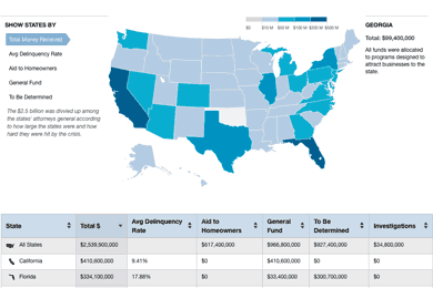
Five of the nation’s largest banks were required to pay states a total of $2.5 billion as part of this year’s mortgage settlement. The money was intended to alleviate the foreclosure crisis, but many states aren’t exactly using the funds that way. We made a map of what each state is doing with the millions of dollars it received.
Two reporters, Paul Kiel and Cora Currier, called every state’s attorney general over the course of a few weeks to ask how their state was planning to spend the money. What they found is that while some states were planning to use the money to help consumers (by funding housing counselors, legal aid organizations, or providing direct payments to struggling homeowners), other states were going to divert the money into their general fund to patch budget holes, or toward programs to attract new businesses.
A map would not normally be our preferred way to visualize this data. Even though this was state-specific information, we’re reluctant to make maps simply to display state data, and prefer to use them only when location matters. But we wanted the presentation to be more interesting than a dry table, so we started mapping the data to see if anything interesting showed up.

We first tried making a choropleth map showing just the amount of money each state got from the settlement. But after noticing that only Texas, California, Florida, Illinois and New York stood out, it was clear this wasn’t anything more than a population map.
Next, we tried mapping the settlement money each state was funneling towards consumers – and ended up with a pretty sparse map. The same thing happened when we mapped consumer money divided by the number of delinquent loans in the state. A few states were giving 100% of their settlement money to consumers, but most states were giving nothing, which meant a map without much variation or geographic pattern. It didn’t seem that a map added anything beyond the headline.

So at the end of the day (literally around 7 p.m.) we decided that this was a map that just shouldn’t be a map. We scrapped the idea entirely, deciding to go with just a comprehensive sortable table. But two things changed overnight that caused us to reconsider.
First, the New York Times published a story on the same topic – emphasizing how many states were not directing their settlement money toward homeowners. Since our story and table weren’t going to break news, they definitely had to add something beyond that finding. That something was our comprehensive dataset, which included a dollar-by-dollar breakdown. Finding a way to give users an interface to comprehend our deep research in a fast, understandable way became our biggest priority.
Second, we began playing around with the Washington Post’s just-published election map, which organized a lot of information about unemployment, race, income, etc., onto a map of electoral votes. The Post maps were a very useful, multilayered way to explore sparse data.
So we decided to map not simply the total money received, or aid to homeowners, or money to the general fund, but instead to map all of these categories. We thought being able to quickly switch from one view to another would let our readers tell the story for themselves. We also published a table underneath the map to give readers who wanted it a deep drill-down into the specifics of each state.
The Nerdy Stuff
We made an SVG map based on Natural Earth Data. Here’s the code for that map. We used Raphael.js, a library for easily drawing vector graphics on the web, to fill in the colors corresponding to the data, as well as add the hover and click functions to each state.
To make the table, we used the Ruby gem FasterCSV to parse a CSV file containing all the information for each state and generate an HTML table. This was really easy with a little bit of Ruby.
data = []
FasterCSV.foreach("public/homeowner.csv", :headers => true) do |row|
  data << row
end

data.each do |row|
  el = <<-HTML
    <tr>
      <td>#{row["state"]}</td>
      <td>#{row["total"]}</td>
      <td>#{row["av-del-rate"]}%</td>
      <td>#row["consumer"]}</td>
      <td>$#{row["gen-budget"]}</td>
      <td>$#{row["tbd"]}</td>
      <td>#{row["fraud"]}</td>
    </tr>
  HTML
end
The next hurdle was linking the data to the map. First we needed all the data accessible so that when you clicked on each state, it’s specific information appeared. Since our SVG map already had an ID for each state (the state abbreviation), we added a state-abrv class to each state in the table.
<td class="#{row["state-abrv"]}"Now each state in the table and each state in the map shared a common element, which we could use to write our click function. But each time a state was clicked, we didn’t want all the data to appear at once – we needed to limit it to just one category (like Aid to Homeowners or General Fund). We did this by giving each state five data attributes that corresponded to each of the five categories in the sidebar.
<td class="#{row["state-abrv"]}"
  data-1="Total: $#{row["total"]}"
  data-2="Delinquency Rate: #{row["av-del-rate"]}% "
  data-3="Aid to Homeowners: $#{row["consumer"]}"
  data-4="General Fund: $#{row["gen-budget"]}"
  data-5="To Be Determined: $#{row["tbd"]}”
</td>
I hadn’t realized how easy it was to link data in a CSV file to the DOM through data-attributes. But with those attributes in place, it was pretty simple to write a function that would bring up only the appropriate data when you clicked on a specific sidebar category and then an individual state.
path.click(function(){
  var info = $("td."+it.key).attr("data-"+index);
  $(".details-box").html(info);
});
Here, path means each state in the map, it.key corresponds to the state-abrv, and index is just a number from 1-5 that matches both the data attribute and one of the five maps.
Making the table sortable was straightforward with Tablesorter.js, and with just a few more lines of code we made each link in the left sidebar trigger the table underneath to sort by the corresponding category. Linking the sidebar categories (total money, delinquency rate, etc.) to the table emphasized how each view of the map was tied to a particular column. We tried to further emphasize that map/table connection by having each column change color slightly when it was selected.
We also used our own open source StateFace font, which is made of tiny state shapes, to go along with each state name.


