


In November 2021, ProPublica published a series of immersive investigative stories about a statistical cancer-risk model created by the Environmental Protection Agency. Our reporting showed that although the model revealed increased cancer risk in communities all over the country, the agency did little to stop the toxic air emissions that were causing the increased risk — or even to inform affected communities.
Discovering the Information Gap
Building the project required that we develop a thorough understanding of a complex statistical model, ground-truth the sometimes unreliable data that had been self-reported by polluters, solve technical challenges associated with massive data sets and interview people who lived and worked near dangerous pollution.
The project builds on a series we worked on alongside The Times-Picayune and The Advocate of New Orleans in 2019. That project was about the residents of “Cancer Alley,” a region of southeast Louisiana home to many refineries and chemical plants. While residents had long complained that they were being sickened by industrial smokestacks, many regulators and corporate spokespeople argued the air was safe to breathe.
Companies that emit industrial pollution have long been required to report their emissions to the EPA, which makes the data public in an online database called the Toxic Release Inventory. But our reporting in Louisiana found that the TRI data is not precise enough to show the fine-grained degrees of risk in industrial areas, which left the people living closest to facilities unsure about their safety.
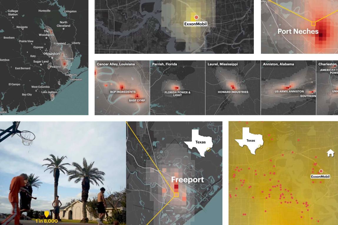
When we began researching how we might obtain data that would enable us to quantify pollution levels and cancer risk at a finer scale, we found out that the EPA had actually created its own high-precision model called the Risk-Screening Environmental Indicators Model, or RSEI, which was capable of doing just that.
The trouble was, the EPA published the results of the RSEI model in an interface that makes it very difficult to understand where the pollution travels and how serious the associated cancer risk is.
RSEI uses emissions estimates industrial companies submit to the agency each year along with weather data and facility-specific information to estimate concentrations of cancer-causing chemicals in half-mile-wide squares of land across the country. Using the powerful tool, we found that we could estimate how the emissions from, say, a plastics plant could be elevating the cancer risk near an elementary school several blocks away.
After we published a visual story about the dangerous concentrations of carcinogenic air blanketing neighborhoods in southeast Louisiana, we recognized the need for a deeper, national analysis. So we embarked on a two-year endeavor to identify toxic hot spots and to build an interactive map residents could use to look up the estimated cancer risks at any address in the country.
Taking the Investigation National
Expanding our original Cancer Alley analysis to include the entire country presented an enormous data challenge. The EPA organizes RSEI by splitting the entire country up into 810-by-810 meter grid cells. For each cell, there are rows for concentrations of every chemical attributed to each facility.
There are around 29 million 810-by-810 meter grid cells nationwide and more than 1.4 billion rows of data for a single year. Even using the largest database instance available on Amazon Web Services, it took up to a week to run queries on the data. Often, our queries took days simply to fail. It was a long, demotivating slog.
That’s when some colleagues told us about Google BigQuery, which is a Google Cloud services product that allows you to do SQL-style queries on very large data sets. Using BigQuery, code that once took a week to run finished in minutes.
Because of this dramatic speedup, we were also able to expand our ambitions. Averaging five years of data would make our analysis much more robust, since averaging across that time would account for a facility that happened to have had a particularly bad or good year in our observation data set. And because our analysis was meant to calculate incremental lifetime cancer risk, taking a five-year average instead of a one-year snapshot would result in a much more accurate estimate.
Loading in five years of RSEI data increased the size of the database from about 1.4 billion rows to about 7 billion rows. Yet BigQuery happily crunched through it.
When our code finished running, we had detected more than 1,000 toxic hot spots — some the size of a single grid cell, some encompassing entire cities or regions. We were also able to determine which facilities were responsible for the highest average cancer risks within a given radius surrounding them.
This led us to some shocking initial findings, one of which did not stand up to scrutiny once we started reporting it out.
Questioning Assumptions
Our colleague Ava Kofman started pursuing an initial finding that appeared to indicate that Boeing was responsible for substantially increasing cancer risk over the city of Portland, Oregon. But her interviews and comparisons with state databases showed that the company had actually misreported its data to the EPA, and that faulty data had shown up as a massive overestimate of risk in the RSEI model underlying our analysis. Boeing subsequently fixed the problem and sent amended data to the agency.
Ava’s finding led us to stop what we were doing and rethink our assumptions. We created a large-scale, systematized fact-checking process. We reached out to each of the top 200 facilities (ranked by the level of nearby cancer risk) to ask them if their emissions reporting was accurate — and if not, whether they would resubmit 2014-18 data to the EPA. Of the 109 companies that responded to us, 71% confirmed that their reported emissions were correct, and 29% noted errors, which we asked them to correct. We then worked with RSEI experts to adjust the output of the model to reflect the chemical concentrations the companies provided to us directly.
Finding Stories in the Data
Once we completed the nationwide interactive map, we had a trove of potential stories before us. Some of the hot spots we identified, like Cancer Alley and the Houston Ship Channel, were infamous. Others, like the cloud of toxic ethylene oxide covering a large swath of Laredo, Texas, were not previously known — even to residents breathing the contaminated air.
Seven more ProPublica reporters joined the effort. They fanned out to report out the conditions on the ground in some of the nation’s most toxic industrial areas and to investigate the state and local policy decisions driving the high emissions rates there.
Early on, we were interested in understanding which communities were most affected by the toxic pollution. Since RSEI data is available at the census-tract level, we were able to join our cancer risk estimates to demographic information. This analysis estimated that predominantly Black census tracts experience more than double the level of toxic industrial air pollution as majority-white tracts.
We were also curious about which companies were the primary drivers of the toxic pollution. We mapped the facility ownership profiles of the nation’s dominant chemical companies. We then computed the number of RSEI grid cells in which each company independently elevates cancer risk above various EPA risk thresholds. We published the results of this analysis in the first story of our “Sacrifice Zones” series.
After our stories and interactive news application launched, the EPA announced a raft of targeted actions and specific reforms including stepped-up air monitoring and scrutiny of industrial polluters. In February 2022, three Democratic U.S. representatives introduced a $500 million bill that would require the EPA to create a pilot program for air monitoring in communities overburdened with pollution.


