The U.S. Department of Education recently released the largest and most comprehensive snapshot of the educational opportunities afforded to millions of students across the country. The new data include information on which students are taking advanced courses often tied to academic success, the experience level of teachers, as well as the racial makeup of schools.
We used the data to look at why some states are leaving low-income students behind while others appear to have leveled the playing field when it comes to enrollment in important courses.
We also used it to create our Opportunity Gap news application, which lets readers find information on specific schools and compare them to similar schools.
Because the data also provide loads of brand-new material for education reporters, we’re hosting a conference call Tuesday at 3 p.m. to discuss how to use the data in local stories. Just sign up here, and we’ll get you the call-in information.
Our news application makes it easy to point readers to profiles of specific schools or districts. Here’s our guide on how to use it, including instructions on how to share your findings from within the app and how to embed a special link to it in your story.
What’s new about this data?
In June, the Office for Civil Rights released, for the first time, detailed information on the number of children enrolled in particular classes, such as Advanced Placement courses and advanced math, and the number of inexperienced teachers at each school.
We had early access to the data and combined it with information on poverty, using the percentage of students in each school who were eligible for the government’s free and reduced-price lunch program. Our analysis included data on all schools in districts with at least 3,000 students, which account for more than three-quarters of all students in the United States. Read our complete methodology for more details.
Here are some tips for analyzing the data to generate story ideas in your state or district.
Start by looking at how your state compares to others
The graphic on the left-hand side of our main “Opportunity Gap” page illustrates the statistical analysis we did to see how strong the relationship was in each state between poverty and enrollment in five programs: AP courses, gifted-and-talented programs, advanced math, physics and chemistry. The darker the shading, the likelier it is that children in wealthier schools are enrolled in that kind of class, compared with children at low-income schools.
The courses included in our analysis have been associated with academic success, including high-school graduation and college attendance. States where low-income children often miss out on advanced courses are said to have an “opportunity gap.”
As you’ll see, clicking on “chemistry” brings North Dakota to the top of the list, which indicates that high-poverty schools in the state offer less access to chemistry classes than wealthier schools. If you select “AP courses,” you’ll see that Oklahoma and Kansas shoot to the top of the list, meaning that there’s a stronger relationship in those states between poverty and whether kids are enrolled in AP courses.
We were surprised to find virtually no opportunity gap in Florida when it came to AP course enrollment. Our reporting showed that over the past decade the state has undertaken a major effort to close the gaps for low-income and minority students.
Delve deeper into your state’s results
Starting from the same feature on the left of the Opportunity Gap home page, you can click on your state to get more detailed information.
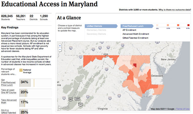
On each state page, you’ll find the number of students included in the survey, as well as the number of districts, schools and teachers at those schools.
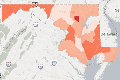
By moving your cursor over the interactive map, you can quickly compare districts by the percentage of low-income students living in each, and also by the percentages of students enrolled in certain classes.
Compare
We’ve built a lot of interactivity into the database to help sort through the list of schools and to make useful comparisons between them.
On each school or district page, you can compare it to others by clicking on the “nearby districts” or “high/low poverty examples” buttons in the left sidebar or typing a school name and selecting it from the menu that pops down.
You’ll see that the results for each school or district pop up like baseball cards.
Sort the cards by clicking the categories—for example, “% Inexperienced Teachers” or “% Advanced Math Enrollment”—using the “Sort by” tool on the left side of the screen. You can remove schools or districts from the page by clicking the “x” at the top right of each card. Add more information by typing and selecting from the left text box, up to a maximum of six cards.
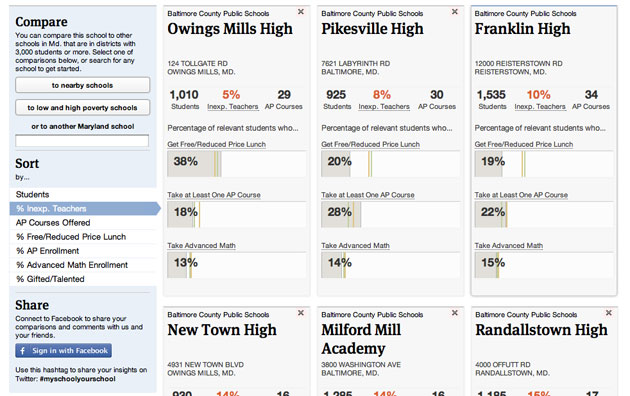
Once you’ve found an interesting sample of schools, copy the URL of the page you’re on and post it in your story or on social media. The link will take people to a web page showing the comparison you’ve built.

Download more detailed information
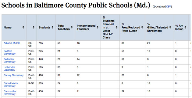
We’ve also created a special “expert view” for each state and district, which shows all the variables at once and lets you download the results as a CSV for importing into Microsoft Excel or a database application. Click on the “See a table of all results” link from the “Reporters” box at the bottom left of any state or district page.
Share your findings
We’ve created special Facebook buttons all over our schools database. Use them to log in and share your observations and comments on school and district comparisons. Just fill out the “share” box on the left and click “post.”
If your wall is set to “public,” the link will post there automatically and will also appear on our site. If your wall is private, your name and comments won’t pop up, but others will still be able to see the school or district cards you’ve chosen (they’ll display on our site from an “Anonymous User”).
Correcting the data
We spent several weeks verifying the accuracy of the data. Where we were able, we corrected extreme outliers and contacted hundreds of schools to verify their data. However, we may not have accounted for every problem, and we welcome feedback.
If you find an error in this data, please tell us.