


Editorial design is a many-splendored thing. Cliché as it may be to say a picture is worth a thousand words, there’s no denying that even the most skillful and vivid deployment of the written word can benefit from a thoughtful visual presentation. Photography, illustration and video can humanize a story’s characters. Charts, graphs and other data visualizations clarify complicated concepts. Typography and color set an emotional tone. And bringing cohesive form to it all is perhaps the most invisible and least understood aspect of editorial design: layout.
A good layout works its magic by modulating visual rhythm and contrast to determine what elements of the article are emphasized and how much. If a cast of characters is introduced one by one, a small inset portrait of each at the start of every paragraph can reinforce the pace of the writing. If the story’s focus shifts to a new location, a large establishing photo of that landscape can signal a change in the story’s focus. Choosing instead to make that image small, off-center and surrounded by generous white space offers a different kind of contrast and tells a different story.
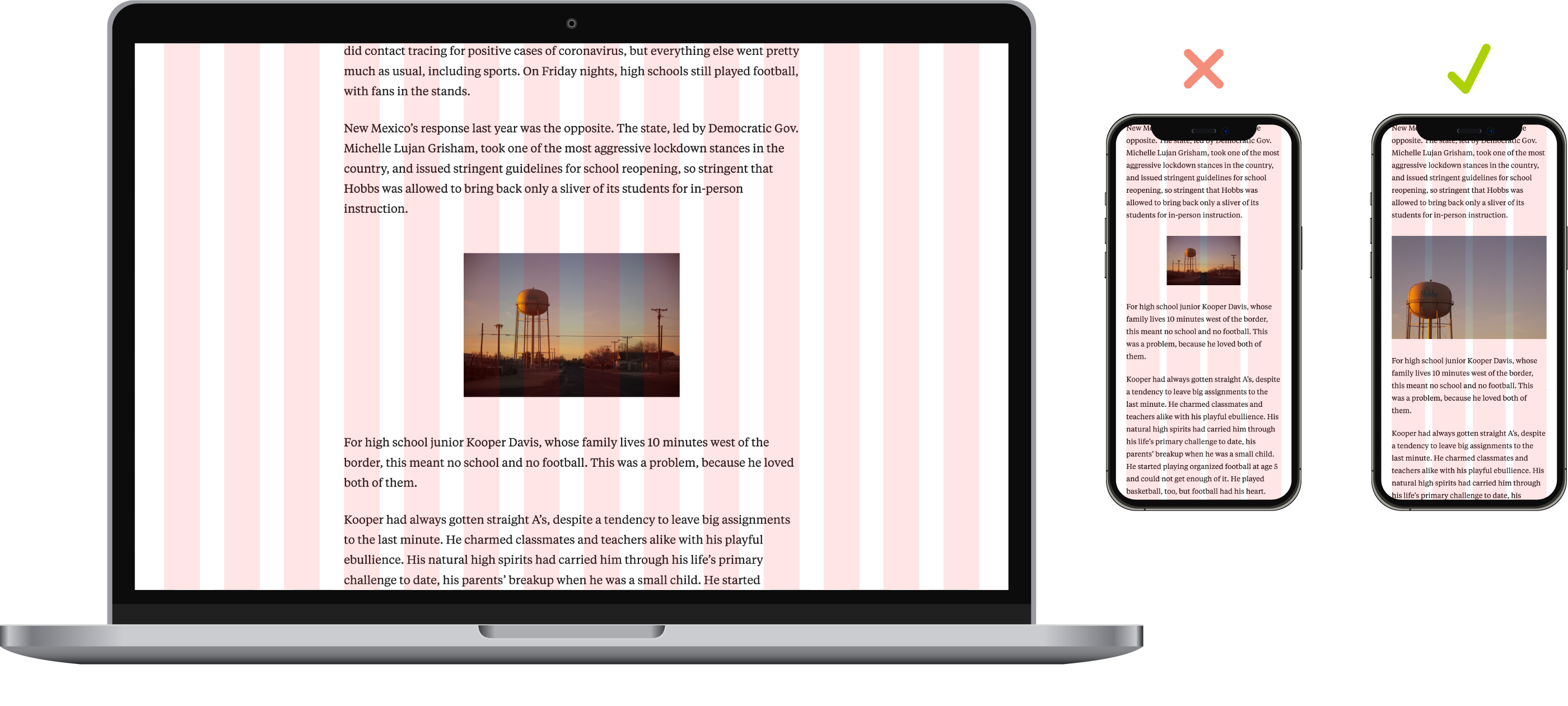
The size and position of images and text can be just as communicative as their content, and the possibilities are virtually limitless.
When we overhauled ProPublica’s article design system last year, sophisticated layout capabilities like these were a top priority. Building our article layout framework was a balancing act of providing a range of options that’s wide but not overwhelming.
How It Works
Our articles are built on an underlying grid structure, which varies depending on the size of the reader’s device or browser window. On most mobile phones, the layout is based on a narrow four-column grid. On a tablet, it might be six or eight columns. And in a large desktop browser window, there’s enough room for 14 columns, the largest version of the grid.
The main article text occupies the eight-column span in the middle of the 14-column grid, which keeps lines from getting too long for comfortable reading. On smaller screens, the text fills six columns of the eight-column version of the grid, four columns of the six-column version and all four columns of the smallest version.
All other layout elements, such as photos and illustrations, use combinations of several attributes to specify how they behave on the grid. Let’s take a look at them.
Size and Position
With the 14-column version of the grid as a basis, a layout element can be one of 15 sizes. Size 1 is one column wide, Size 2 spans two columns and so on, all the way up to Size 14. The 15th and largest size expands into the margins to take up the full width of the browser. On smaller screens, each size automatically scales down in rough proportion to the size of the grid; for example, Size 5 spans five columns of the 14-column grid, four columns of the eight-column grid and three columns of the six- and four-column grids.
Layout elements are anchored to the inside of the main article text area by default. They can be positioned to align to its center or its left or right edges. If they have a positional basis of left or right, they can be pushed into the text area or pulled into the outer columns, up to three columns in either direction. As with the sizing, the spacing automatically scales down in rough proportion to the size of the grid on smaller screens.
Text Wrap
Layout elements have the option to completely interrupt the article text or have the text wrap around them. In situations where there isn’t enough space for the text to wrap comfortably, the layout automatically ignores the text-wrap preference.
Responsiveness
The automatic proportionate scaling of elements across different screen sizes can be very handy, but it can also be a liability. An image that looks great at a small size on a large screen might become tiny and illegible when scaled down on a small screen. To solve this, we included the option to force an element to take up the full width of the text area on smaller screens, regardless of its size on larger screens.
Also included is the option to use two different versions of an image for small screens and large screens. This might be used for two different crops of the same photograph (a wide crop for large and a close crop for small) or for two different orientations of a bar chart (horizontal/large and vertical/small).
Diptychs, Triptychs and More
A set of any number of elements can be placed side by side on the grid, which is useful for making something like a row of portraits. The same responsive options mentioned above can change the row of elements into a stack on smaller screens to keep them from becoming prohibitively small.

To Code or Not to Code
We’ve built all of these layout options into our content management system so they don’t require our producers to have any coding skills to use them. But for code-savvy power users who want to extend the system, it’s built with Column Setter, the open-source tool we developed for grid-based editorial design. We recently updated it with a variety of new features.
Read More

The many possible ways of combining our layout framework’s streamlined set of variables — size, position, responsiveness and text wrap — make it a simple but powerful system. Offering a total of 616 unique ways to present a layout element, its visual vocabulary is expansive! Used in conjunction with photography, illustration, video, data visualization and our systems for typography and color, the framework gives our editorial teams tremendous flexibility to be visually expressive in whatever way best suits the story they’re telling.


