
Today ProPublica is releasing the data behind our investigative series “Sacrifice Zones,” which revealed more than 1,000 hot spots of cancer-causing industrial air pollution around the country. Researchers can now download the principal data files behind our investigation from our Data Store.
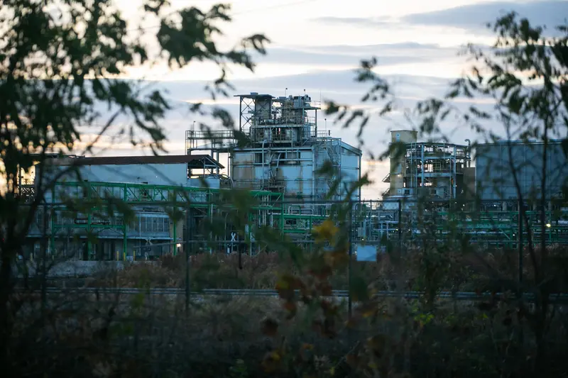
The data that we used for the analysis is based on the Environmental Protection Agency’s Risk Screening Environmental Indicators model, a tool that estimates concentrations of toxic chemicals in the air around industrial facilities. ProPublica mapped and published this information for the first time, giving readers a neighborhood-level view of their estimated cancer risks from industrial air pollution.
We are releasing three geographic files: one for the perimeters of each of the toxic hot spots identified in ProPublica’s analysis (hot spots are defined as contiguous grid squares with estimated excess cancer risk above 1 in 100,000); one containing the grid squares within each of those hot spots; and one containing the point locations for facilities included in our analysis. Users are encouraged to read our methodology and watch our guide for investigating hot spots before working with these files to better understand the strengths and limitations of RSEI data.
We are also updating our interactive map in two important ways.
First, we have updated the data files and map with corrections for errors in EPA’s data. The RSEI model relies on data from the Toxic Releases Inventory, a federal database containing emissions information submitted annually by companies operating large industrial facilities in the U.S. As we revealed in our series, the EPA does a poor job of verifying the accuracy of the industry-reported data in the TRI. Before we published the map, we independently fact-checked data from and contacted 200 facilities in our analysis to ensure that they had submitted correct emissions data for the five-year period of our analysis. While many companies responded to our inquiries, a number did not get back to us by our deadline. After we published, we heard from additional companies that wished to correct the TRI data reflected in our map. We also corrected the locations for a small number of facilities.
Second, we added Puerto Rico and the U.S. Virgin Islands to the map. In doing so, we identified three new hot spots, which are included in our data update.


