


This article was co-published with Source.
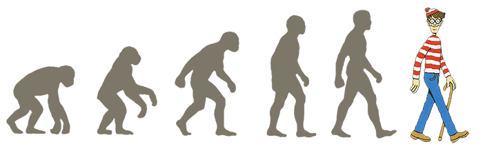
The scene is total chaos: a woman and all her purse’s contents in middair as she trips over a child’s toy, a man hastily trying to gather his spilled laundry, a screaming child weaving through the crowd. Somewhere, in the midst of it all, is the person you’ve been looking for: wearing a red and white striped shirt, black rimmed glasses and a lopsided cap. There he is! There’s Waldo.
Many of us have fond memories of Waldo. But while he looms large in our imagination, our childhood searches for Waldo typically stayed pretty small – Waldo is a tiny person in the middle of lots of other tiny things.
And that’s what this post is about: wee things. Specifically, the wee things that we see as part of graphics, maps, visualizations (wee things in space) as well as the wee things we experience as part of interactions, navigation, and usability (wee things in time). This means everything from sequences of small graphics that help us make comparisons, to tiny locator maps that help orient us within a larger graphic, to navigation icons that give hints about how we should make our way around a page.
Waldo, and the eternal search for him, can actually tell us quite a lot about design. In many ways, Waldo is a great example of what NOT to do when using wee things in your own work. So with Waldo as our anti-hero, let’s take a look at how people read and interpret small visual forms, why tiny details can be hugely useful, and what principles we can apply to make all these little images and moments work for us as designers.
Wee Things In Space
Probably the most immediate definition of wee things are things that are physically small: little things on a page. We see these all the time in news graphics, and we’re probably familiar with some of their forms: small multiples, sparklines, icons, etc. I’ll go into more details about all of these.
These visual forms work because they serve as extensions of our mind – they are cognitive tools that complement our own mental abilities. They do this by recording information for us to make use of later, lending a hand to our (pretty terrible) working memories, helping us search and discover and recognize. We’ll take a look at one task in particular they are great at: letting us make comparisons.
Make Comparisons

Tiny sequences of graphics, also known as small multiples, are great ways to help our brains compare. They are so successful because we don’t have to rely on working memory – every bit of information is in front of us at the same time. This means that we can easily see changes, patterns or differences.
Here are a bunch of examples of small multiples in the wild – maps and planets, first lady hair styles and telegraph signals, food trucks, fashion color trends and dressing appropriately for different climates, the distribution of deaths in the 1870’s and last but not least, Bill Murray’s hats.
 Drought’s Footprint, NY Times
 Kepler’s Tally of Planets, NY Times
 Trucks on a Roll, NY Magazine
Front Row to Fashion Week, NY Times (L) and Weather people (R)

The reason we can make comparisons so easily is because these small multiples take advantage of the built-in capabilities of our visual system. Specifically, something called preattentive processing.
Preattentive Processing
 Table of Preattentive Features, Design for Information, Isabel Meirelles
Technically, preattentive processing refers to “cognitive operations that can be performed prior to focusing attention on any particular region of an image.” But basically, it means the stuff you notice right away. Our brains aren’t like scanners, they throw away most of what the eyes see. But they are good at perceiving simple visual features like color or shape or size, and in fact they do it amazingly fast without any conscious effort. That means we can tell immediately when a part of an image is different from the rest, without really having to focus on it. Our minds are really good at spotting one or two differences when everything else is the same.
Like in this example, you can easily spot Waldo.

It’s easy to spot Waldo surrounded by his arch nemesis, Odlaw.
Or in this example, right? This is not hard.
 Zen Version of Where’s Waldo, Dan Piraro
But obviously, this is not where Waldo typically hangs out! Where he goes, I can’t find him at a glance, and I need to spend a lot of time and actual effort. Our experiences with Waldo are usually something more like this:

A few years ago a group of MIT researchers actually studied what happened when people saw a scene like this. They used eye tracking devices to look at how people go about finding Waldo. This is what happens on a typical search:
 Statistical patterns of visual search for hidden objects, Scientific Reports
Those jagged lines are the path of the eye as it hunts for Waldo (ending in success at the red dot). As you can probably tell, the process is far from straightforward.
So, Waldo basically thwarts our preattentive processing. Instead, he forces us to use our attentive processing: the conscious, slow, sequential process that lets us focus on one thing at a time. This “spotlight” of attention might be good at letting us concentrate, but it makes us pretty bad at spotting Waldo. We have such a hard time seeing him (despite the fact that he’s right there in plain sight) because he doesn’t stand out in any clear way, color or size or orientation.
And obviously there are reasons for why Waldo doesn’t stand out – he is purposely hard to find because his surroundings were constructed to hide him. But in general, we don’t want our graphics or data visualizations to be this much work to understand. If someone had to search that hard to read the information in a chart or graphic, it would be a failure. So if you’re in the business of displaying data, avoid the Waldo strategy.
Instead, take advantage of those preattentive features! In this graphic from ProPublica, the use of color draws your eyes to specific lines of red text.The grey lines are government claims about the succeses and results of the CIA’s drone program. The red lines are the official statements that it doesn’t exist (or rather, the government can neither confirm nor deny). The graphic uses the preattentive feature of color to call out these contradictions.
 Stacking Up the Administration’s Drone Claims, ProPublica
 The Credits Keep Going and Going, NY Times
This graphic from the New York Times uses size to highlight how much longer movie credits have gotten over the years.
Whether it’s size, color, contrast, etc, it helps to have the point you want to get across encoded in one of these preattentive features..
Now the last two graphics I showed were also members of a special category of wee things I like to refer to as TinyText. This is exactly what it sounds like (you make the font size really small). Tiny words can help call attention to differences over time, like this piece comparing editions of the Origin of Species.
 On the Origin of Species: The Preservation of Favoured Traces, Ben Fry
Or they can help us explore the terms used in Hong Kong policy addresses for the last few years, or see the rise and fall of Fortune 500 company rankings.

Show a Process
Small things can also help us show us a step-by-step process. Many examples of this sort of thing involve tiny people, like the following graphics that show figure skating spins, triple axels and toe loops, aerial skiing, and snowboarding tricks.

Imperfect Bodies, Seeking Olympic Perfection, Wall Street Journal (L) and Hanyu Falls Twice, but Still Wins Gold, NY Times (R)
 Gold and Silver Medal Jumps in Men’s Aerials, NY Times
But process graphics are not just useful for Olympics! Here you see the process of all the planes taking off from LA airport in one day. Or the phases of the moon.

Or what happens to wee chickens before they end up at at a supermarket near you.
 Chemicals might be distorting chicken safety-test results, The Washington Post
These process graphics seem to show up a lot in dance moves – for those of you who’ve been waiting to learn Thriller, now there’s a chart for that. Or for that matter, any of these other moves.

Thriller Zombie Dance Steps (L) and Sixties Dance Crazes (R)
Just as wee things are used in dance, they are also used in art. You might remember the wonderful Ed Emberly, who taught us to draw silly monsters and animals using some combinations of tiny circles, squares and lines.
 Draw a Sasquatch, Ed Emberly
We’ve also got process graphics like this one, of the many steps to creating a Japanese woodblock print, or even how to make an origami elephant.

Orientation

Wee things can also be used to orient someone, to give them a bird’s eye view.
One of my favorite features of the text editor Sublime Text is this mini map, which shows you a zoomed out smaller version of the page you’re working on. There’s also mini locator map in this Washignton Post graphic, which stays fixed on the left side of a regular sized map and scrolls down as you move along 14th Street.

Sublime’s mini locator map (L) and Take a stroll down the new 14th Street, The Washington Post (R)
Same idea in this example from WNYC, which lets you see exactly where you are on Fielder Ave as you move horizontally through the photographs of houses damaged by Hurricane Sandy.
 Fielder Ave, WNYC
Or this little map that moves along an enormously long satellite image of the Tigris and Euphrates Rivers (special points to the wee red square which changes shape as you resize your browser window).
 A Rogue State Along Two Rivers, NY Times
Mini locator maps can give you more context for a story, like in this example from Grantland, where the route of an long dog sled race in Alaska is filled in as you scroll – or this vertical version of the same thing, following a drive from St Petersburg to Moscow.

Convey Meaning

Another benefit of wee things is that they pack a punch. A tiny graphic can say a hell of a lot without taking up too much room.
In some cases, that happens by swapping tiny things in for words. The book The Information is full of little inline pictures, like little arrows that convey intonation in speech, or a sequence of little dots to show an early idea for Morse code. Galileo stuck tiny pictures of Saturn  into his writing, using them as just another piece of a sentence.

The Information, James Gleick (L) and
Galileo Saturn drawings (R)
Another old example is a version of Euclid’s Elements by a mathematician Oliver Byrne, who illustrated the whole thing with geometric shapes right in line with the text (I present to you: the wee hypotenuse).
 The Elements of Euclid, Oliver Byrne
Then, we’ve also the mini graphics that many of you are probably familiar with: sparklines. These are tiny charts that show variation (usually over time). Now you can even put them in your tweets.

The 2010 Lexicon, Bloomberg Businessweek (L) and Sparktweets (R)
Another familiar example: the icon. We use icons and symbols all the time to convey a lot of pretty crucial information like what’s down the road, which door to go in, how to play and pause and rewind. On the web these are especially prevalent. We see social and navigation icons everywhere on the web, and they tell us a lot about how to find your way around a website or where to search or even how to like something. The Noun Project is a big repository full of icons you can use for free, kinda.
 The Noun Project
Graphical fonts are also icons, so here’s an example of an font called Stateface, which makes it easy to embed a wee state into a graphic or table.
 Stateface, ProPublica
But keep in mind, that while some icons carry lots of meaning, they don’t all carry the same amount. Icons work because they are recognizable, and if people are not quite sure what they mean, they lose their power. New icons may take time to become commonplace.

But some icons are more equal than others. A study of search icons found that a lone magnifying glass is often not enough to convey “search”, especially when it doesn’t look exactly like the magnifying glass we are used to seeing. Instead, it helps to give people a few more clues, like placing the icon on the top right hand side of the page, or placing it within something that looks like a text field.
On a similar note, not everyone knows that the hamburger icon stands for “menu,” – it is definitely not as universal as a peace sign. Another analysis found that making the icon look more like a button or including the word “menu” made people more likely to understand. So make sure that if your icon is new or unclear, you add extra information.
And of course, this doesn’t mean you can’t make up your own icons, as long as you provide context. We may never have seen a man riding a fish, but in this case it (obviously!) represents a fish hatchery employee.
 Who Goes to Work? Who Stays Home? NY Times
Differentiate
One more benefit of wee thing is that they can help us differentiate individual elements. We often see graphics with lots of small circles, and these imply lots of small individual items. We can easily guess that they are multiple distinct elements, and we might try to hover, or click. The little dots make it clear that these are distinct.
 White Christmas
 In the long run, South China Morning Post
Wee Things In Time
Now I’m going to broaden the scope of wee things a little bit. So far we’ve been talking a lot about physically small wee things: small things in space. But there is also a different, more abstract idea of wee things, and that’s small things in time. These are the tiny moments, the interactions that that we spend only a second or two on, but can make a huge difference to our experiences and our understanding. Another word for these wee things in time (I didn’t even have to make it up) is microinteractions.
Microinteractions


What are microinteractions? You can think of these as small “contained moments.” Changing a setting, logging in, favoriting or liking something, giving a rating, importing or exporting, searching, sorting, syncing, formating, saving, the list goes on and on.
There are a couple of great resources on tiny details and microinteractions that I’ll be stealing examples from, including the book Microinteractions by Dan Saffer, the blog Little Big Details, and Jack Moffett’sDesign A Day tumblr.
These interactions might seem trivial at first. Who cares about a hover state on a button, or a confirmation box, or a minor color change? But when it comes to designing details, Charles Eames said it best: “The details are not the details. They MAKE the design.” So let’s look at what wee things can do to help make our interactions better.
Give Hints
 If only all Waldo searches were this easy
Small, strategically placed hints can help direct someone’s attention to what they are supposed to do, to what will happen once they do it, and whether or not they actually did it successfully. But keep in mind that some hints are better than others. You can’t just say “guy in red striped shirt” and have someone immediately find Waldo. It’s important to give real, helpful hints.
Affordances: What can I do here?

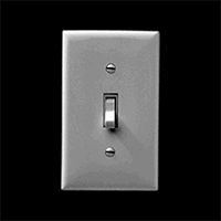
Affordances in the physical world
Hints can take a number of forms, and one is by taking advantage of affordances. In the physical realm “affordances” refer to the attributes of an object that make it do what it does. A wheel affords rolling, a light switch affords flipping, etc.
In the online world, we depend on perceived affordances, like buttons that look like buttons and links that look like links. Much of this is convention – there is nothing about blue underlined text that necessarily means a link, but these conventions have become established over time, and we use them to give people a clue as to what they can do.

Affordances in the online world: buttons look like buttons, links look like links
Here’s an example of a pretty obvious hint. I see a blinking purple circle and think – ah! I can click here. However, I still have no idea as to what will happen when I click that arrow. I can guess, but its probably better for everyone if we’re not clicking around the internet trying to guess at what will happen next.
 The United States of Oil Spills, Bloomberg Businessweek
Feedforward: What will happen when I do it?

And that’s where feedforward comes in. It’s kind of like feedback, but it happens before the action. It gives me a clue not only of what I can do, but what will happen once I do it – so I know what will happen BEFORE I perform the action. This means that people can perform that action with confidence.
Here you can see that a black strip to the side of the menu comes out when I hover. It’s a small hint, but it’s just enough for me to guess that when I click on that button, the black strip will turn into a sidebar. And that’s exactly what happens. Again, feedforward is not just “that I can click” but actually “what will my clicking accomplish.”
Feedback: Did I do it?

Finally, feedback is another kind of hint. Feedback tells you the result of your action, whether it was a success or a failure. This is important! Did I sort this thing correctly? Did I select the right state or search for the right terms or go to the next screen in a sequence? Every action should be acknowledged. The best part about feedback is that it can later turn into another hint about what will happen next.
So let’s look at some hints in the wild.
 Extra Virgin Suicide, NY Times
Here is an examples of a nice way of providing feedback – a series of dots along the bottom of the page. As you scroll, they highlight one by one. The left to right sequence also hints at the direction that I need to swipe to move through the interactive. “Fewer Helmets, More Deaths” at the New York Times is another example of this hint style.
Speaking of swiping, here are a couple of hints that I need to swipe to access whatever comes next, from a NY Times article, the Duolingo app, and my iPhone. As you can probably tell, this is early days for mobile swiping intructions – designers haven’t quite made up their mind about the direction of the arrow, the direction of the swipe, or even whether “slide” is actually the better word.

Swipe (or slide) to begin on an NY Times article, Duolingo app, and iPhone
On a similar note, a lot of newfangled article templates these days want us to scroll down. So often we see something like this: a big fat arrow pointing down with the word “View,” or a pair of arrows with the words “Scroll to Read.”

Somehow these instructions always remind me of the Push/Pull signs on a door. They might help a little bit, but usually if it needs a sign, the door is not designed very well.
So can we design interaction so that labels and instructions are not necessary? In the case of scrolling on the web or on a phone, I think it’s very possible, and in fact has already been done successfully.
Here’s an example of an article page that has no arrow or button or “Scroll” or “View” instruction. Yet I immediately know that there is content underneath, because I see a small part of it. Even if I change the window size, this website always shows me a little sliver of content, which tells me there is more to read – without any arrow.
 Texas Six, Victory Journal
The wee sliver of an app icon gives you a hint to swipe left.
This can work for mobile too. When I go to share an image on my iPhone, I get a bunch of app icons that show me my options. I can see four of them in full, but I also know that there are more to the right. How? I can tell instantly because I see a portion of the next app icon peeking out from the right side. The need for a “See More” label has been eliminated by design (and a wee sliver).
Don Norman in The Design of Everyday Things says that “When a device as simple as a door has to come with an instruction manual — even a one-word manual — then it is a failure.” Now, we obviously shouldn’t strive to eliminate all instructions and labels, because often these small words are quite necessary. But we should at least think about designing alternatives. And usually, less manual is a good thing.
Bring Data Forward
Wee things can also help us present data up front instead of forcing a user to go seek it out. In some cases, bringing the data forward actually eliminates the need to interact at all. For example, Chrome shows an icon of a speaker if there is music playing in one of your tabs, so you don’t have to frantically click through and try to find out where that music is coming from. On an iPhone, the calendar app shows you the date without you having to open it up to find out. The clock app shows you the time.

Chrome’s speaker icon (L) and iPhone apps that reveal data on the outside (R)
Note that the weather app does NOT does do this, for no good reason. For all the weather app cares, it is ALWAYS partly cloudy. But it doesn’t have to be like this! A small tweak to the weather app will show you exactly what you typically go into the weather app to find out – the current weather.
 A weather app icon that shows you… the weather.
Chrome shows you all the instances of a term you’ve searched for on the page, in the little tick marks on the right side, bringing that information forward to you.

Chrome highlights instances of a search term along the right-hand side.

Now I know it’s 5:40pm office time.
This website, rather than just telling me the office hours, includes what time it is at the office, right now. This is a relatively simple achievement (computers are pretty good at telling time) but it saves me the trouble of calculating time zone differences. In many cases, it’s possible to take advantage of basic information, like the time, to help give people the information they really need.
In a similar vein, Pixelmator uses the eyedropper tool to show me the color I’ve selected, and Amazon shows me the number of items in my cart. In both of these cases information that could have been hidden behind yet one more interaction or step is brought to the top.
Pixelmator’s eyedropper tool and Amazon’s shopping cart.

The humble coffee grinder.
Prevent Errors
Microinteractions can also help us prevent errors. As an intro to this, let me tell you about my favorite machine in the world: the coffee grinder. With a coffee grinder, it is literally impossible to hurt yourself because it only works when it’s closed (unlike, say, a blender).
And preventing screw ups is really good! Store shelves are filled with products in which this is not the case. One very painful example is the instant soup cup, which can easily tip over and lead to scalding burns (not to mention hungry emergency room patients).
 Instant soup cups: where design flaws increase risk of burns.
In one of my favorite collection of wee things (and this is an actual picture in an actual scientific paper) we see the exact angle at which an instant soup container will topple over. The taller and narrower, the smaller the angle (and the more likely the accident). So why are so many soup containers tall and narrow? Soup cup desginers could prevent this error by making them very flat and wide, but for whatever reason, they have chosen not to.
In the online realm, preventing errors means designing microinteractions that make it impossible to mess up. For example, in this smart microinteraction, I am stopped from accidentally being born in the future.

Gmail knows that I used the word “attached” so prevents me from sending my email without the attachment (or at least gives me a heads up beforehand). But the second dialog is an example of what not to do. In the options below, which one will cancel my payment?

Gmail catching potential errors (L), anonymous website introducing confusion (R)
Not so easy, right? Whenever possible prevent mistakes. Be clear.
Surprise

While many wee interactions are invisible – our experiences so seamless that we don’t even notice them getting in the way – some of the best interactions we do notice. Microinteractions can add little moments of surprise to an otherwise mundane task.

This can take the form of clever little transitions, like this example from Victory Journal where the menu icon transforms into a X to become the close button.
 Campfire App
Or it could just be darn helpful, acknowledging that memory is limited and forms are boring. Ever start filling out an online form and immediately forget what you were supposed to type? In this example from Campfire, the instruction label is still visible, it just moves out of my way.
Surprising microinteractions can also take the form of little notes to your users that are funny or have some personality. If you’re uploading something to Dropbox that will take a long time, it tells you to go grab a Snickers. And if your text gets too long, Google Voice just stops counting the characters and says “Really?”.

Dropbox being friendly (L), Google Voice poking fun (R)
The Vimeo cancel/dismiss button is labeled “I Hate Change.” All these things take into account that you’re designing for real people who have a sense of humor.

And then there are just tiny interactions that are fun, like shaking your phone to get a snow globe effect on your photographs.
 Shake! Shake! Shake!
Or pressing this spinner over and over again to get a new prediction about who’ll win the Senate.
 Who Will Win the Senate? NY Times
These are not always explicitly about conveying information, but they’re tiny moments that we can make an emotional connection to the user. Delight is something we may overlook sometimes or not bother spending time on, but it can really make a difference. If this tour of wee things has taught us anything, it that it’s worth trying to make those connections, worth spending a little more time and effort on the details – even if they are very small.
 Paul Noth, The New Yorker


